UX&UI / 2020

Designing a Better User Experience for Network Elements Management Systems through a Simulation-based Design Method

Responsibilities: User Research, User Flow Design, UI Design & UX Evaluation

The Challenge

Efficiency and error tolerance are considered as important factors that create a good user experience for users (i.e. system administrators) of Nokia SystemHub where network elements used to implement network services are maintained. Mistakes or omissions would lead to a situation where Operation Support Systems (OSS) cannot communicate with network elements. However, the current SystemHub has poor efficiency and error tolerance, which requires redesigning user flows to improve usability. 


My role​​​​​​​

Brought in as a lead UX designer to iterate SystemHub, I conducted a complete task analysis and user flow evaluation by adopting a simulation-based design method. I then refined the user flow and UI design.

#Think

Stakeholder Interviews
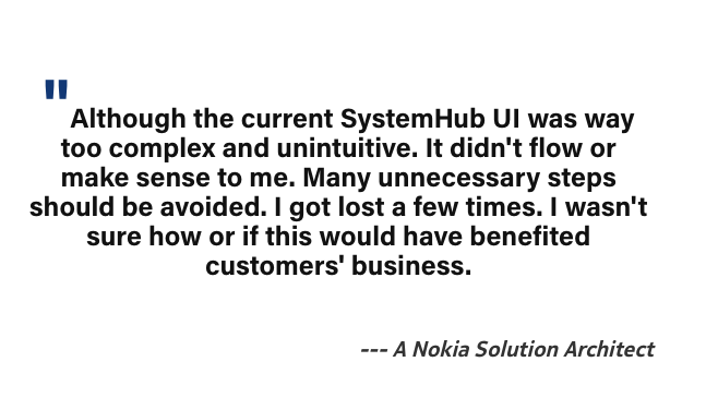
The request for redesigning SystemHub was triggered by feedback about poor usability from the customer. To understand the fundamental problem completely, I started to interview key users and stakeholders. I pulled two solution architects for SystemHub development and one project manager who has been collecting customer feedback in interviews. Results were then compiled into a document with key themes and overlapping interests
One of the key themes was cognitive load. stakeholders felt that the current design was too complex; too many unnecessary manual interactions. 

Research Guided by the Idea: Avoid Unnecessary Complexity
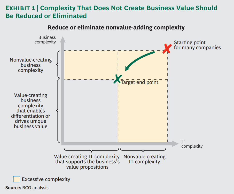
Complexity has been reported by external customers and internal stakeholders as a major issue in SystemHub. Unnecessary complexity should be greatly reduced and even eliminated. According to Boston Consulting Group, the impact of reducing nonvalue-creating complexity on IT costs and performance can be significant. They estimate that an effective simplification effort can reduce application and infrastructure costs by up to 50 percent and total IT costs by as much as 30 percent. It can also give the IT organization far greater flexibility and agility and can improve its overall ability to support the company’s business objectives.
 
One of the key themes was cognitive load. stakeholders felt that the current design was too complex; too many unnecessary manual interactions. 

Simulation Testing

The aim of the simulation testing method is to redesign the system in such a way that there is minimal cognitive load, all unnecessary manual interactions with the system are removed, and only necessary data inputs and navigational interactions are left. In simulation testing, all manual interactions with the system are calculated, and the cognitive load in those interactions is recorded.
I researched the typical use scenarios of SystemHub and then simulated how a user would use the product in a particular scenario. While doing the simulation, I calculated the number of steps (i.e. any interaction with the product UI, including scrolling and hovering) the user had to do to complete the scenario.
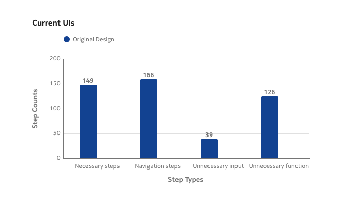
Each step that the user has to complete to reach the desired outcome was analyzed, and divided into four groups:
 
#Necessary steps
Steps where the system can’t know what to do, e.g. entering a parameter for the first time.
#Navigation steps
Navigating from one view to another (pages, tabs, windows).
#Unnecessary data input
Entering parameters and values that were already entered earlier.
#Unnecessary functions
Functions that don’t move the user towards the desired outcome in their use situation. e.g. changing item status in order to modify or use it.
 
Numbers of data inputs from memory were counted as well. 

Use Scenarios

One of the key features of SystemHub is the Lookup Service where system administrators “customize” (or “fine-tune”) specific parts (i.e., the values of certain workflow variables/parameters.) of a workflow in services without actually changing or creating new versions of the workflows. The Lookup Service GUI enables the system administrator to define and delete lookup tables as well as maintain existing lookup tables. 

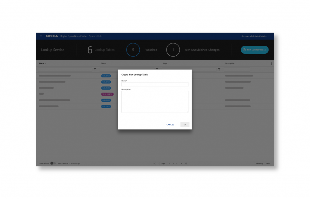
Use case 1: define a new lookup table

The users can create a new lookup table, including defining a name, description, other relevant parameters, etc. 
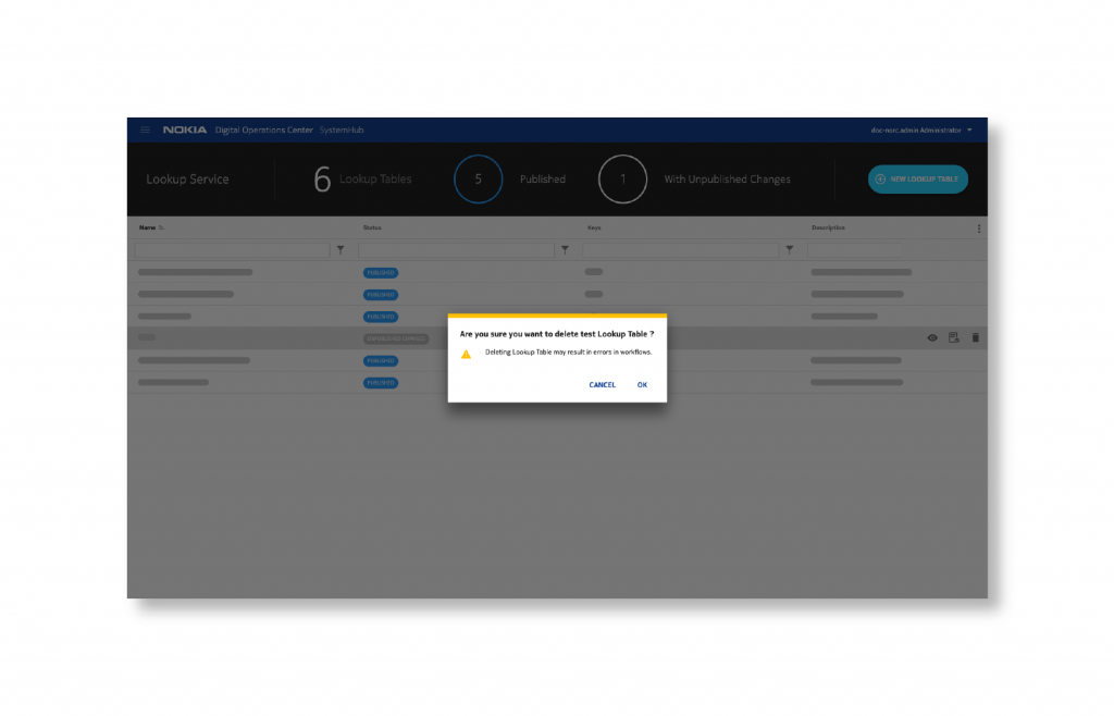
Use case 2: delete a lookup table

The users can delete a lookup table and all data within it. This may break many workflows.  Hence the users are prominently warned and clear confirmations are asked from the user.
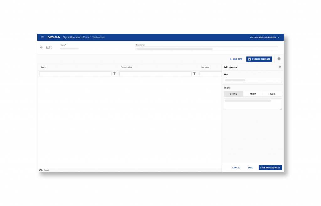
Use case 3: edit a lookup table

The users can edit the contents of a selected table. The UI will provide options for locating the desired data: find a specific key first and then edit a specific value.
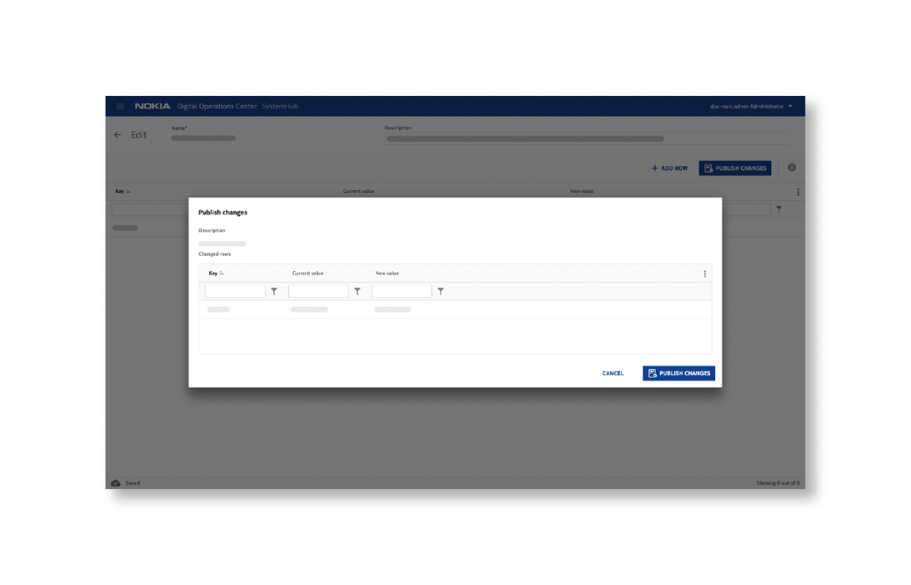
Use case 4: publish changes to a lookup table

The lookup table editor UI enables controlled deployment of changes made to a lookup table. The changes are “visible” only when the lookup Service editor user makes an explicit operation to publish the changes.  

Simulation Test Results

After the simulation test, I found that necessary steps only took 29.2% of the whole task steps but 32.3% of the steps were unnecessary functions and input. 32.5% of the steps were navigation steps. Users were required to remember information in 3.3% of the steps.
Design Improvement

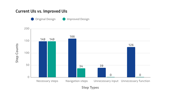
An improved UI design was created relatively mechanically based on the analysis. Unnecessary inputs and functions were left out. Navigation was minimized by re-organizing the data and functions in the UI. The total amount of actions was greatly reduced. Besides, some new features were included to improve the error tolerance where human errors could be recovered.
How the research was compiled and shared

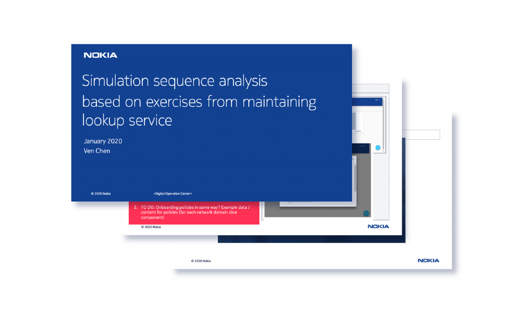
As fresh research and redesign were completed and used to jumpstart a new iteration, I placed the research findings into a kickoff slide deck that I would eventually present to key stakeholders and decision-makers. From this, we’d agree on the direction of the iteration, the timeline, and the team needed to carry it out. We didn’t iterate for the sake of iterating, so this was part of the process that helped us evaluate each iteration.
#Make

Mockups

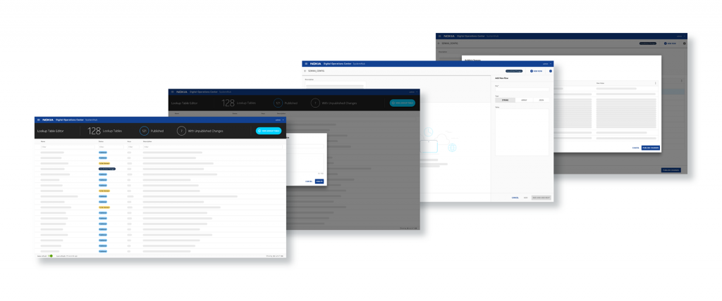
As the design direction was established, I began creating the structure and hierarchy of the design, as well as the aesthetic treatments. Full user flows and unique interactions were prototyped for sharing internally and testing with users. 
User Testing

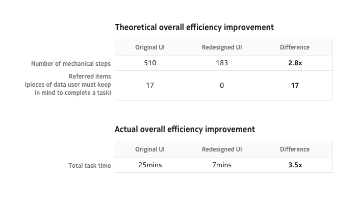
User testing and session recordings were regularly run to observe organic user behaviors and check the total task time (from the first trigger until the result is reached). The total task time can be a direct objective measure of productivity. Theoretically, the overall efficiency will be increased to 2.8 times of what it had been before. But, surprisingly, users could manage the task 3.5 times faster. In total, the efficiency improvement is somewhere around 3.5x. The redesign did not include utility improvements. With those, the overall productivity improvement is likely to be in the range of 4x to 5x.
#Make

Impact

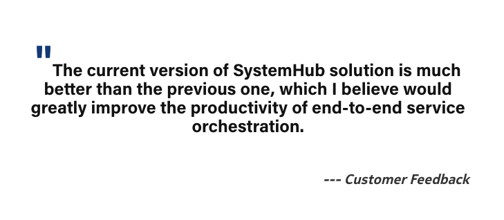
The redesigned scenarios-based SystemHub simulation sequence was used in the customer demo, and it received extremely positive feedback from the customers. The demo requested has increased to 35% from what it was in 2019.
#Reflection

Considering where we were before I joined the SystemHub project, versus where landed, I was proud of what I achieved. Due to the simulation-based redesigning, the product became one of the highest efficient tools in OSS. 

The simulation method is easy to apply, and it provides concrete and reliable numbers when trying to measure efficiency. It also forces the designer to think about concrete use scenarios and tasks for the users, so it fits perfectly into the overall design process as well. It is very suitable for OSS products since most of them are meant to increase and enable the operational efficiency of service providers. 
 
Decision-making is an important part of the sequence for users to reach the optimal end result. To make a decision, users may need to access the necessary information and possibly keep some pieces of it in mind to make the comparison. Therefore, recording the pieces of information that a user must store in their mind during the sequence to reach the optimal end result is also very important.
Using time, however, to measure efficiency should be very careful as other factors can greatly affect the task time completion (the user’s ability to use the devices, lag on the server, etc…). I have also counted the times when a user needs to keep some information in memory or when they are picking some information from the UI. This method does not fully address large utility gaps or a completely wrong concept – when something has been modeled in a fundamentally wrong way.
 
Although the simulation testing requires a completed product where users can go through the task step, I think it could also be extended to design a new product. When a new product UI is being designed, the designer can again research/ideate the use scenarios, and then start to draw only the necessary UI elements that are required for completing one scenario (the UI can be unrealistic at this point). Then the designer takes another scenario and checks whether it is possible to complete the scenario with the existing design or not if not, the designer modifies the design accordingly. After identifying the necessary functions, the designer will move on to dividing the user flow into different views if necessary, improving the layout, taking into account the existing design system, etc. but still continuing to simulate the use scenarios while designing, so that the user flows do not become overly complex, and the right data continues to be visible when the user needs it.