UX&UI / 2022
Redesigning Sanoma Ad Manager for Better User Experience
Responsibilities: Concept Design, UI Design & UX Evaluation
The Challenge
Sanoma, a Finnish media group, had built an Ad Manager MVP to serve media agency users and SME businesses with do-it-yourself advertising solutions where they design, manage and follow up the reporting for the Ad campaigns. However, the current ad publication processes and UIs were designed separately for agency users and SMEs with different levels of access to functions and features, which made it impossible for users to have a coherent user experience and select features and functions as their experience level grows.
My Role
As a lead UX Designer, I started with interviews with clients, expert evaluations, and simulation-based evaluations to find out the right problem to be solved. After that, I conduct benchmarking to understand the best practice and deliver recommendations to the clients. Via multiple rounds of co-design workshops, I worked with the client to identify product vision, areas for improvement, and possible design opportunities. After that, I redesigned the Sanoma Ad Manager and reviewed the design along the way with the client. The outcome received high customer satisfaction.


Start with Context Immersion and Problem Diagnosis


Diving deeper via ...
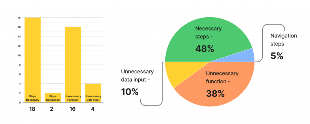
Identified key issues




Next, know the best and get inspired
Key findings
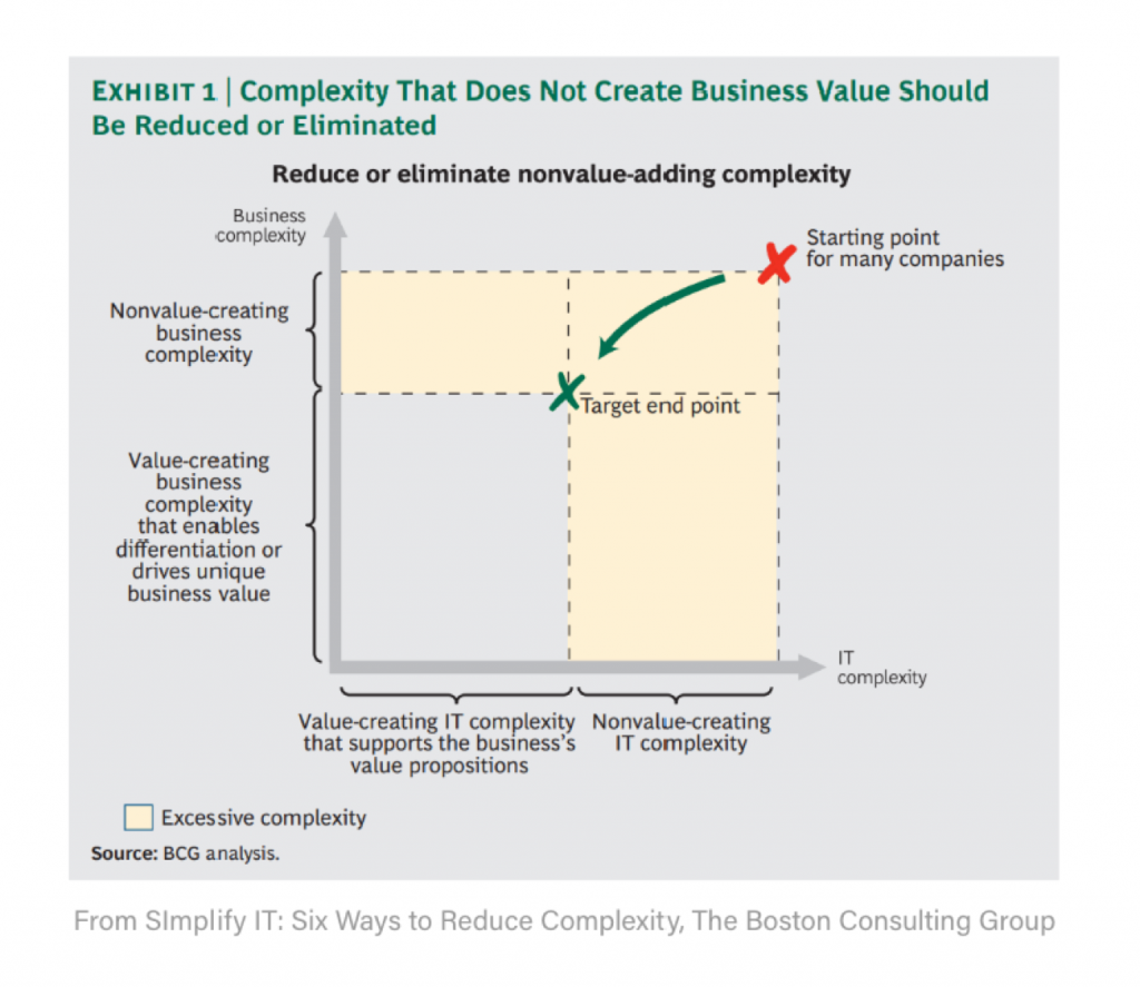
Design Guided by the Idea: Avoid Unnecessary Complexity
According to Boston Consulting Group, the impact of reducing nonvalue-creating complexity on IT costs and performance can be significant. They estimate that an effective simplification effort can reduce application and infrastructure costs by up to 50 percent and total IT costs by as much as 30 percent. It can also give the IT organization far greater flexibility and agility and can improve its overall ability to support the company’s business objectives. Unnecessary complexity should be greatly reduced and even eliminated.
The solution to addressing the needs of digital product users with different skill levels lies in a different understanding of the way users master new concepts and tasks.
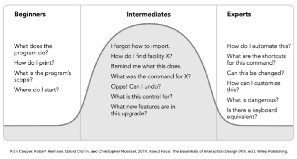
The demands that users place on digital products vary considerably with their experience.

Yay! Get my bearings
How to design for users with different skill levels?
Our goal should be threefold:
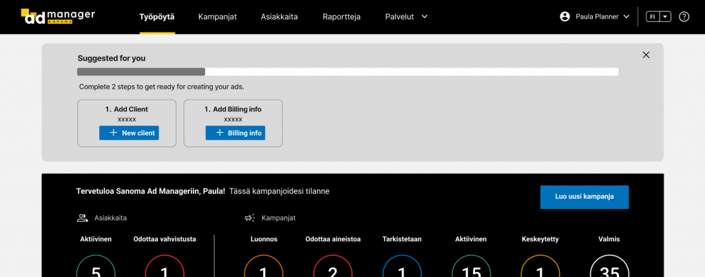
– To rapidly and painlessly get beginners into intermediacy
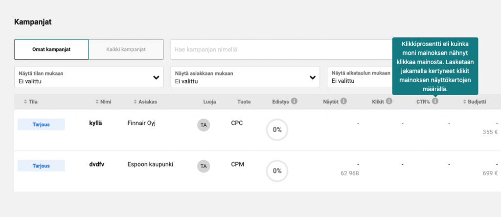
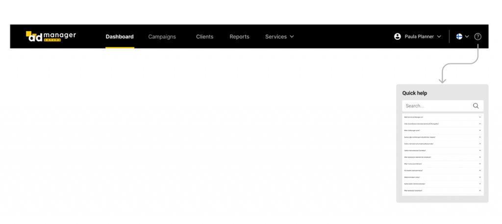
– To enable intermediates to become experts by extending their abilities so that they can increase their productivity and satisfaction
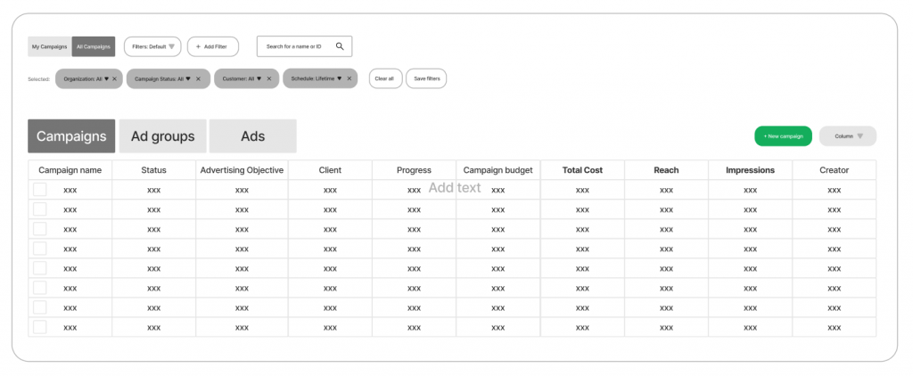
– To accommodate the beginners and experts but optimize the system to the largest segment of the users – intermediates.
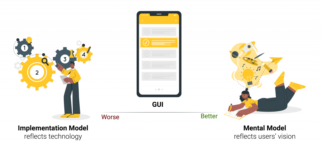
The closer the GUI comes to the user’s mental model, the easier the user will find the software to use and understand.
People don’t need to know all the details of how a complex mechanism actually works in order to use it, so they create a cognitive shorthand for explaining it, one that is powerful enough to cover their interactions with it, but that doesn’t necessarily reflect its actual inner mechanics. The closer the represented model comes to the user’s mental model, the easier he will find the program to use and understand. People tend to form mental models that are simpler than reality; so if we create products that are simpler than the actual implementation model, we help the user achieve a better understanding.

Let's now improve the design!
Boost the efficiency
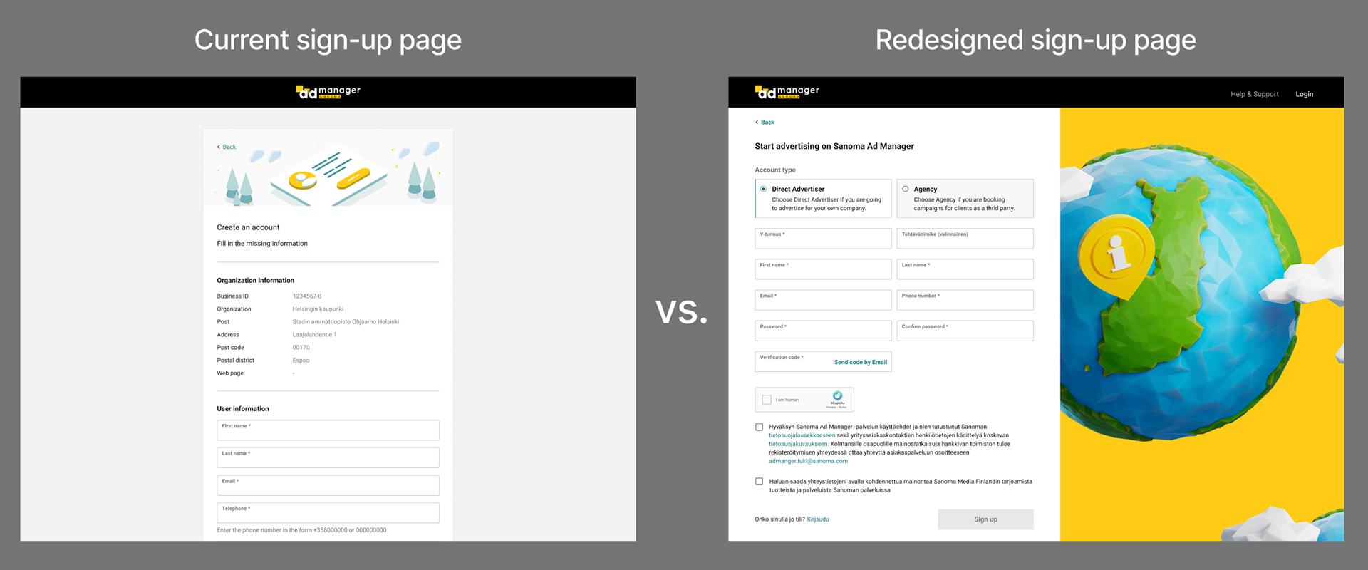
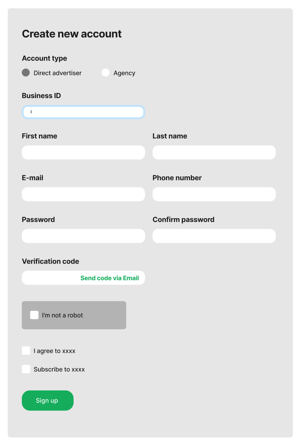
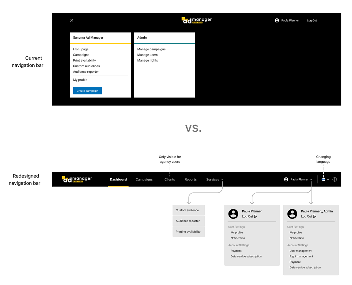
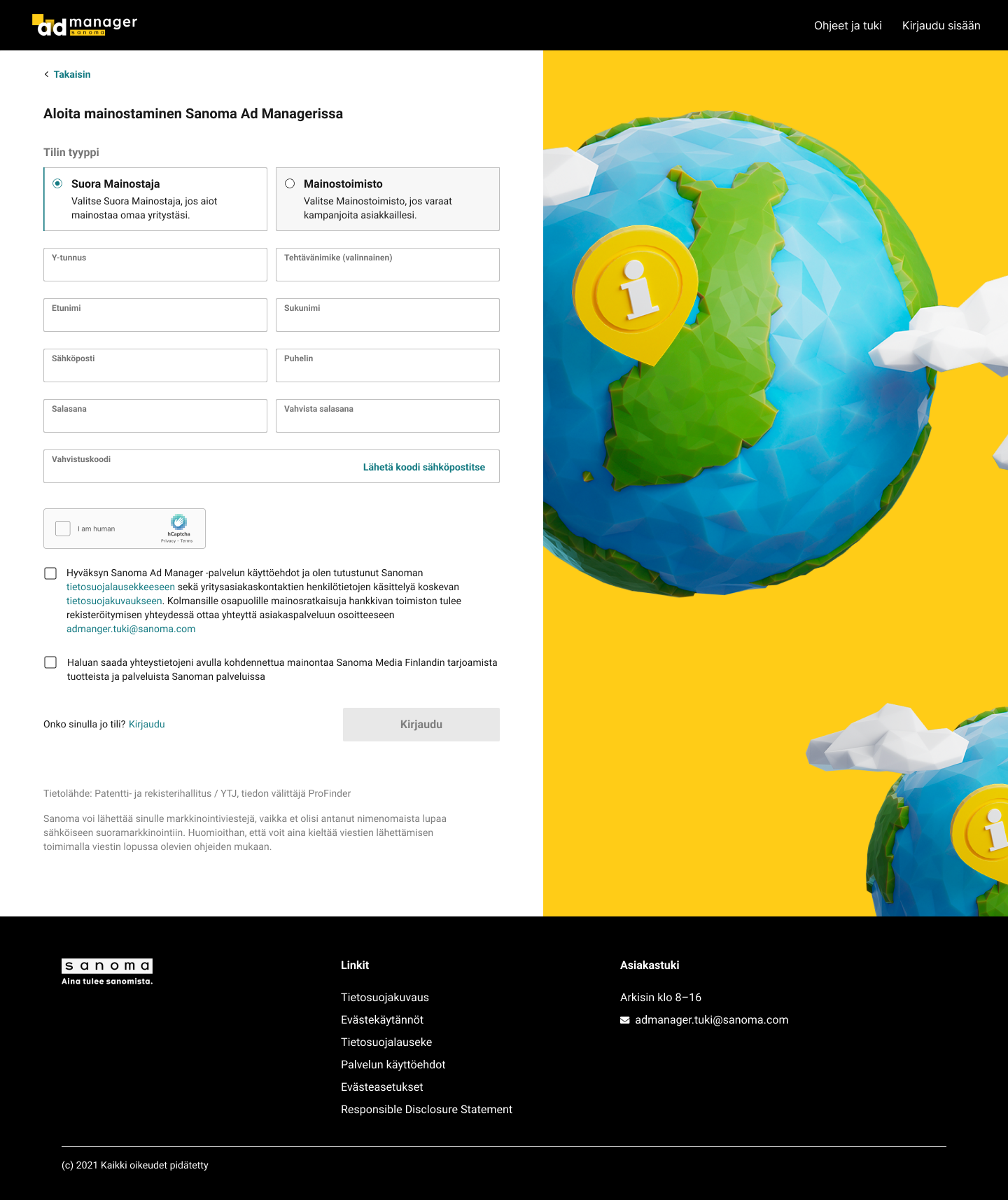
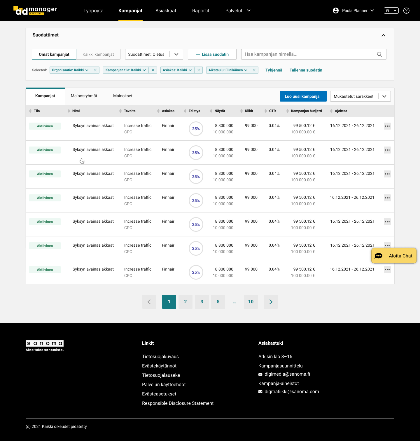
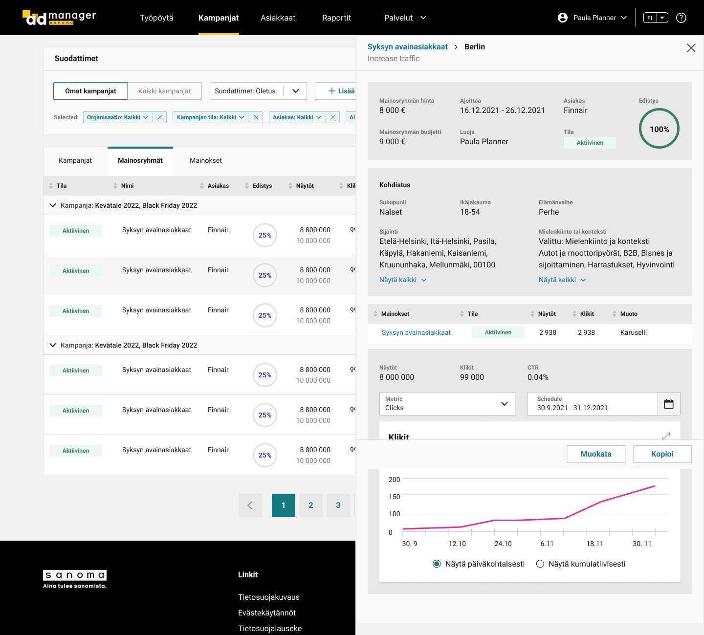
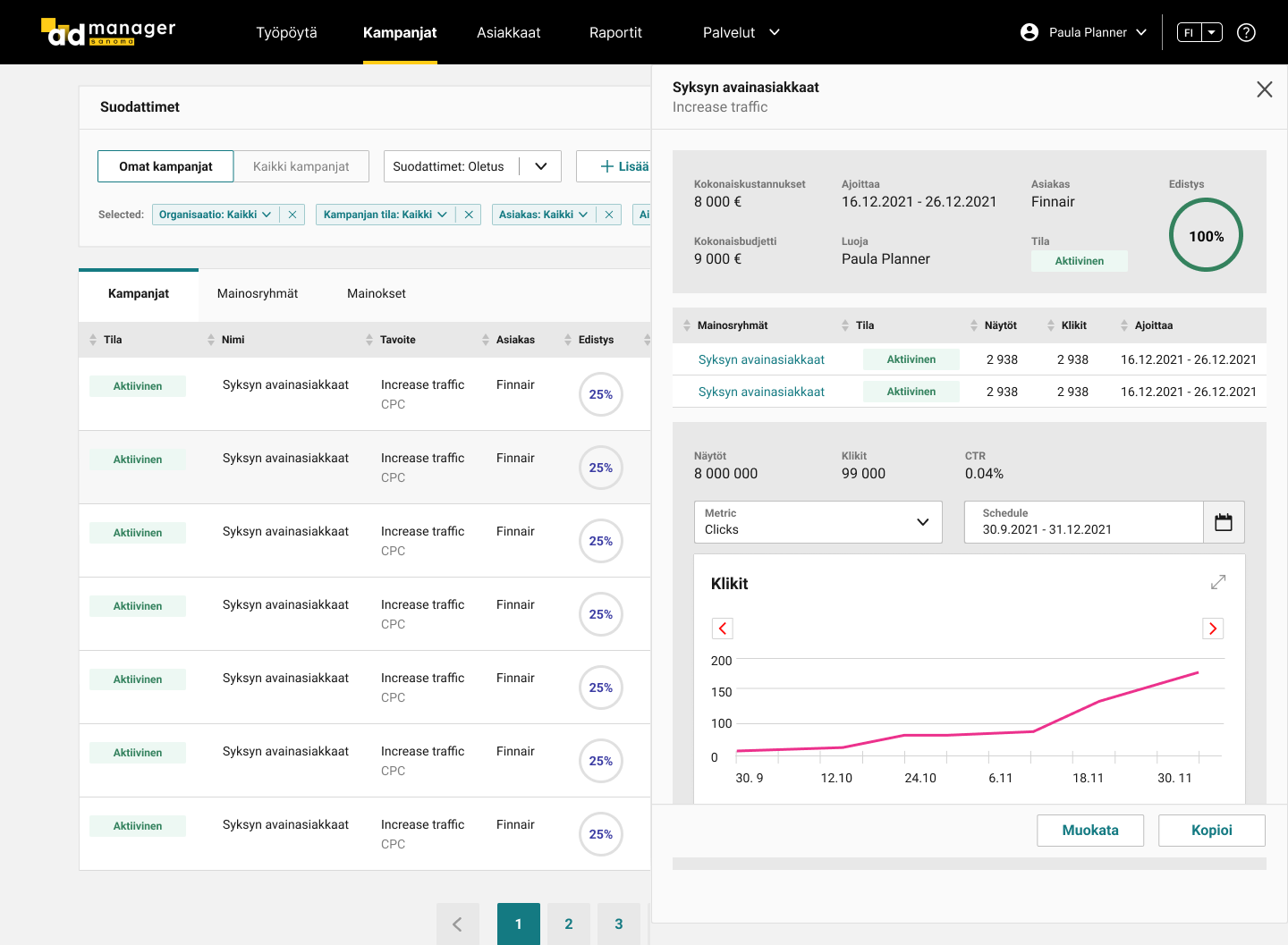
An improved UI design was created relatively mechanically based on the analysis. For example, in account creation, unnecessary inputs and functions were left out. Navigation was minimized by re-organizing the data and functions in the UI. The total amount of actions was greatly reduced. If the number of referred items in the current UIs were zero, the efficiency of the redesigned UI would be 1.7x better.


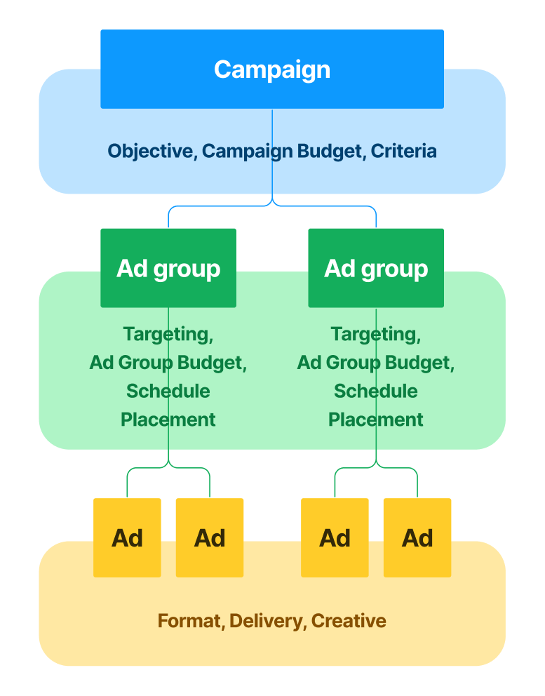
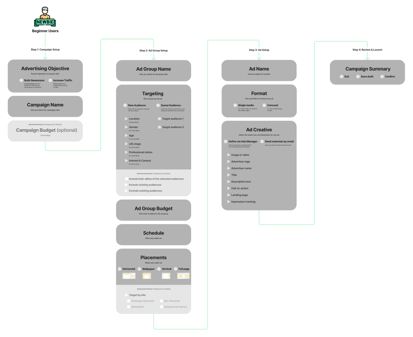
Designing for beginners

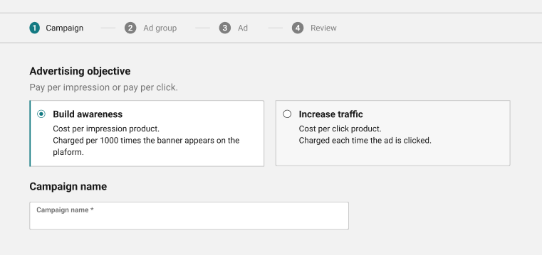
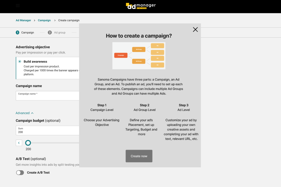
Designing for intermediates
Designing for experts

Let's now improve the design!
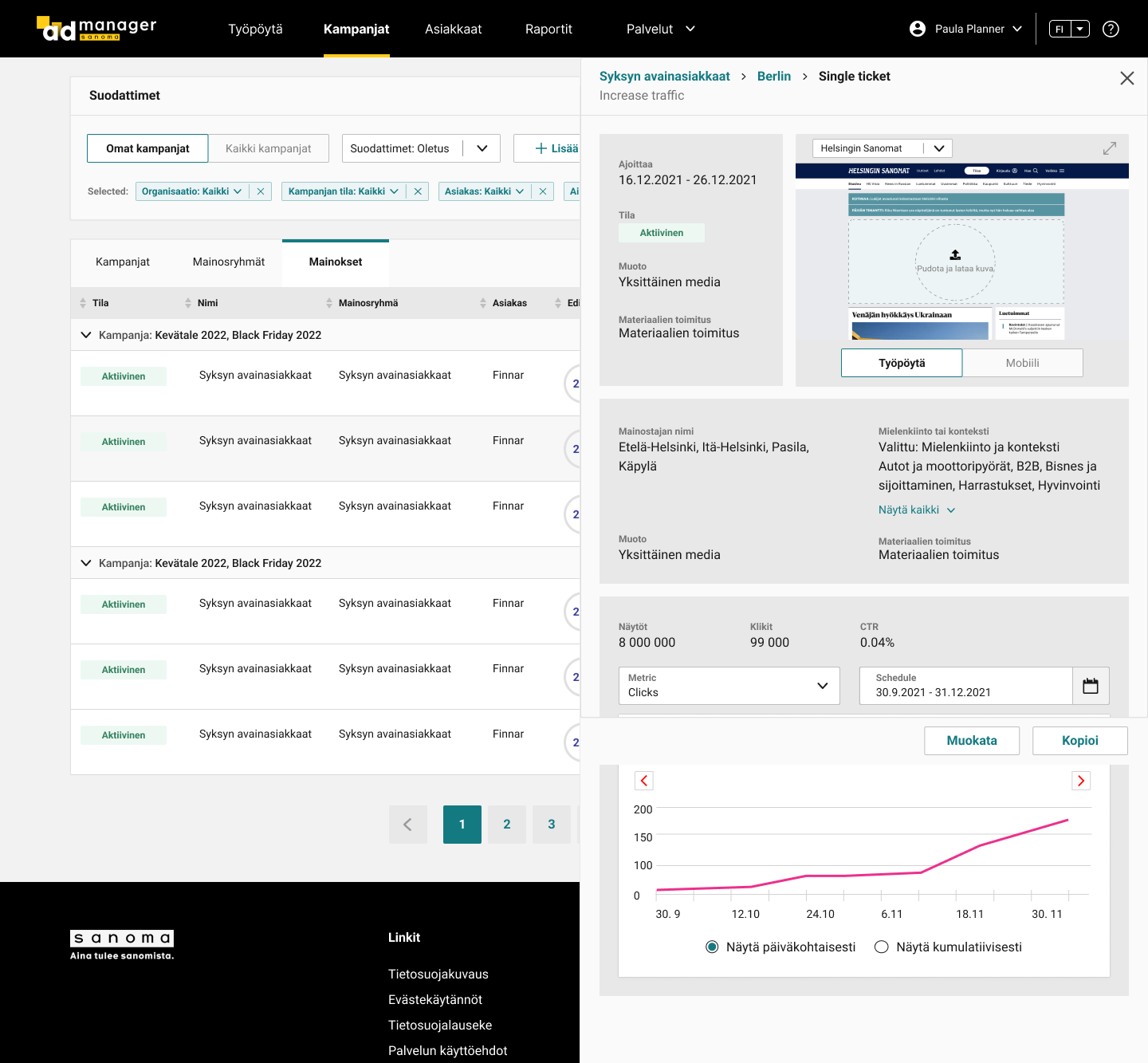
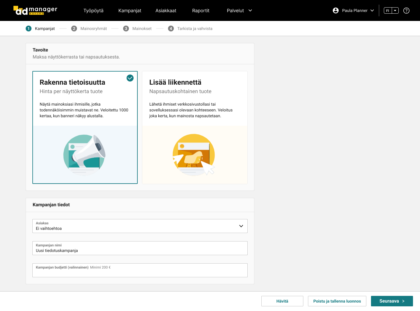
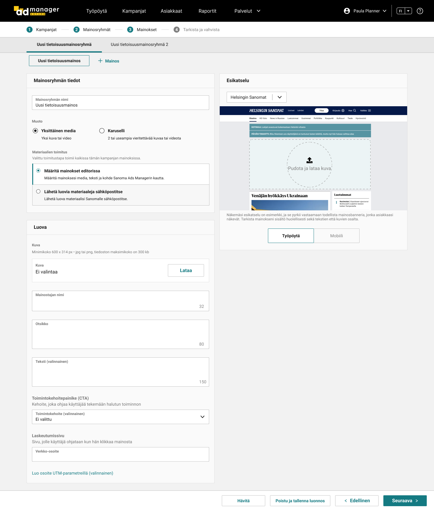
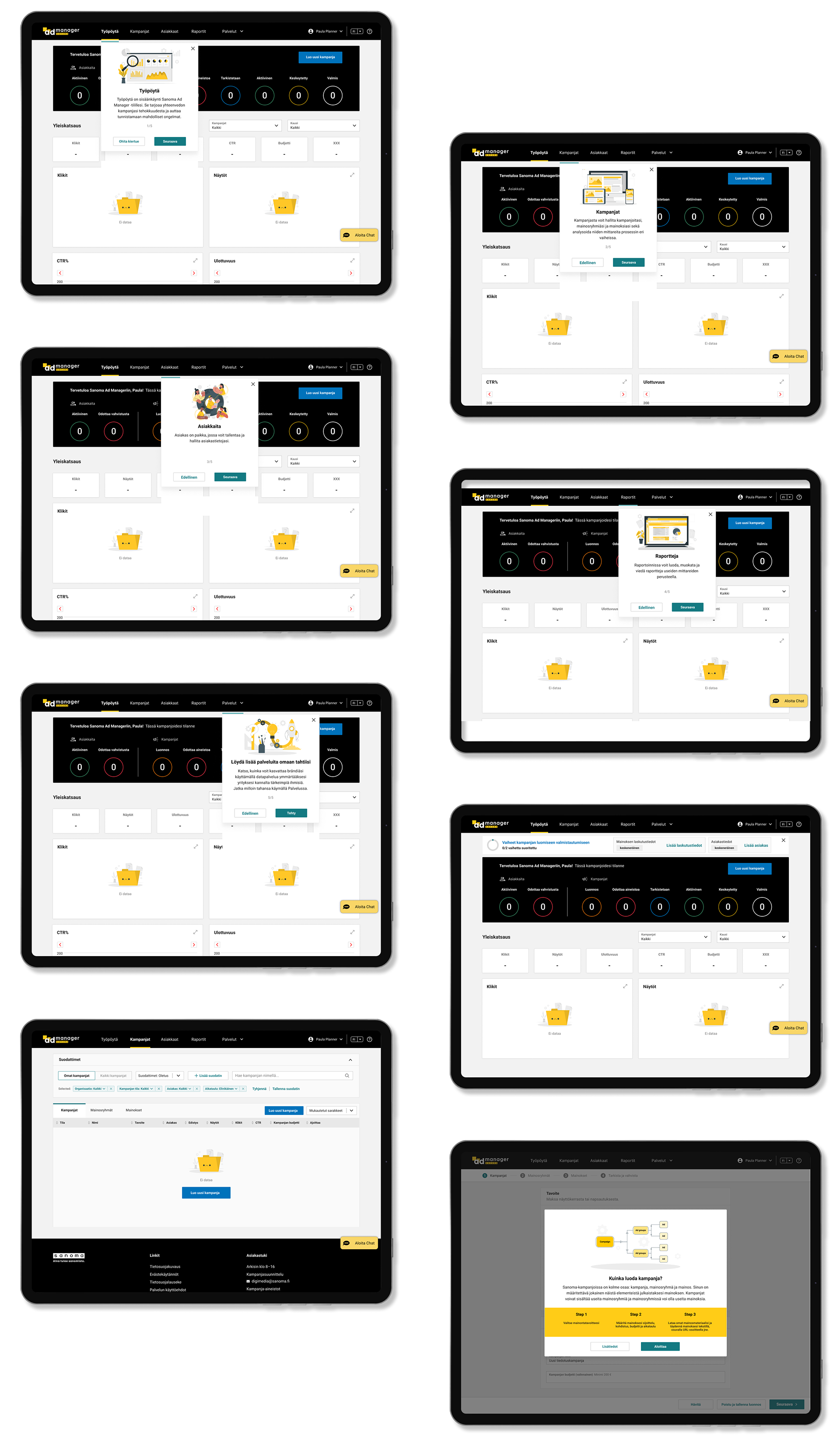
As the redesign was completed, I presented it to the customer through a design review workshop. The client was very satisfied with the final outcome.
Main pages
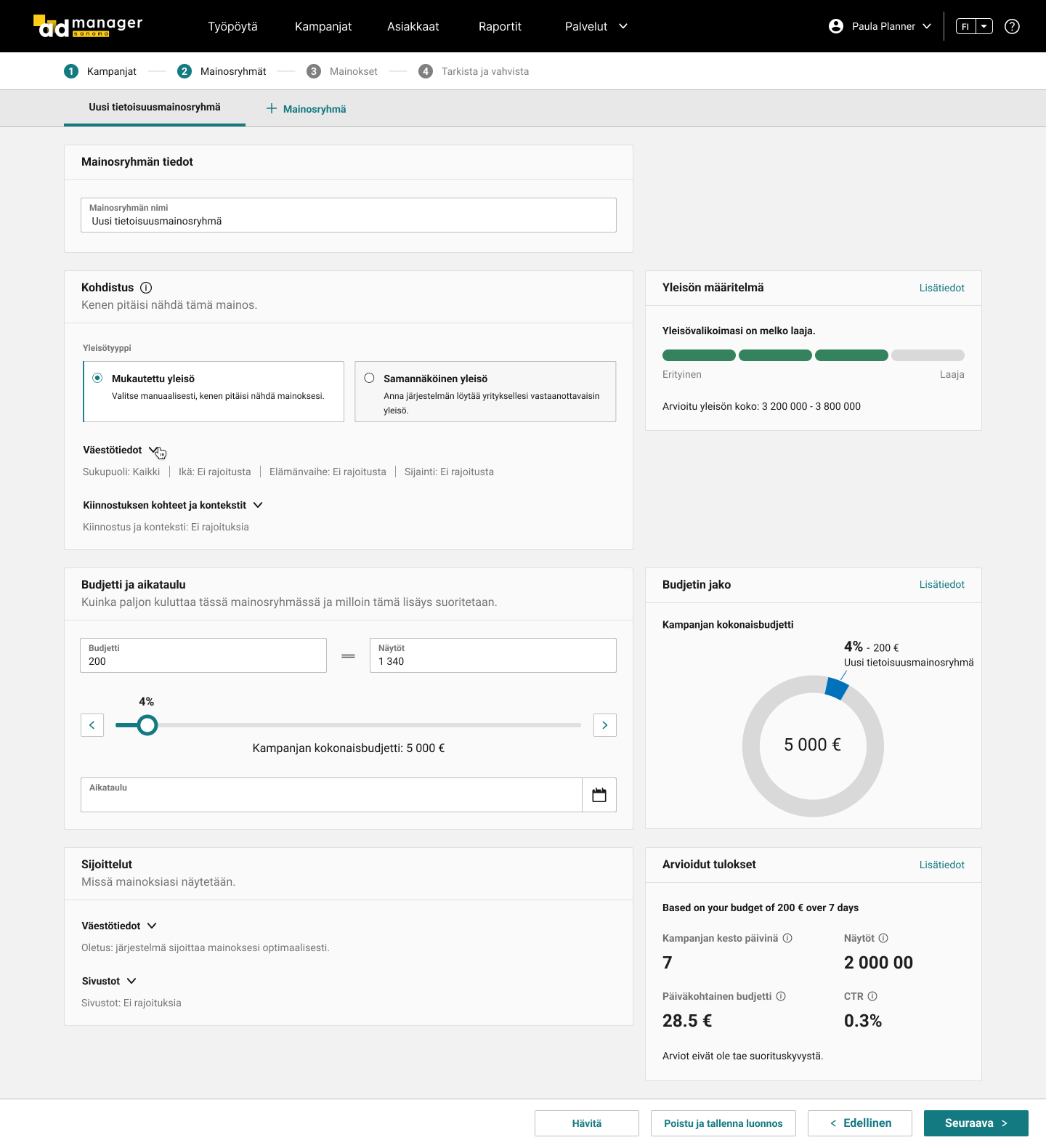
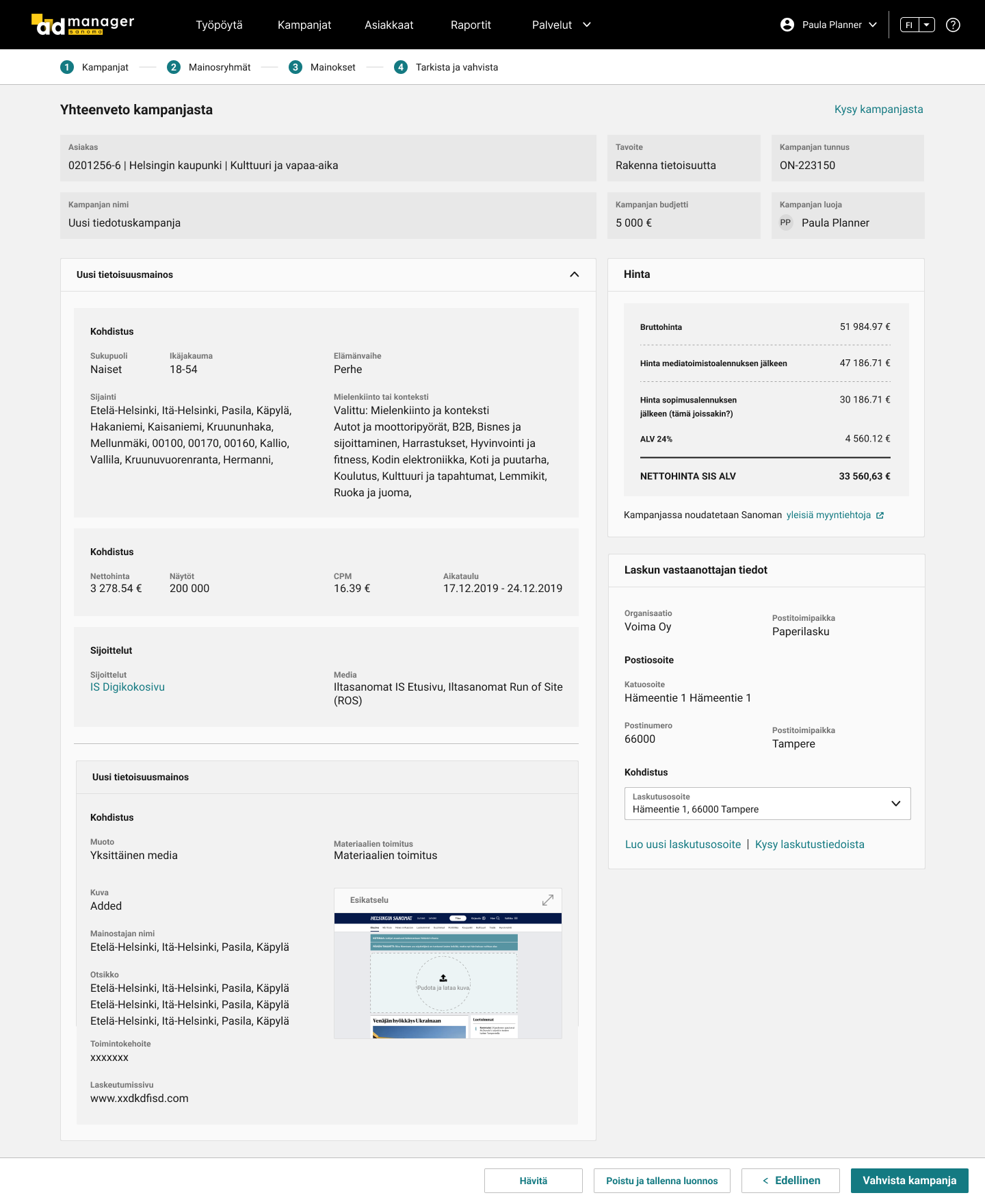
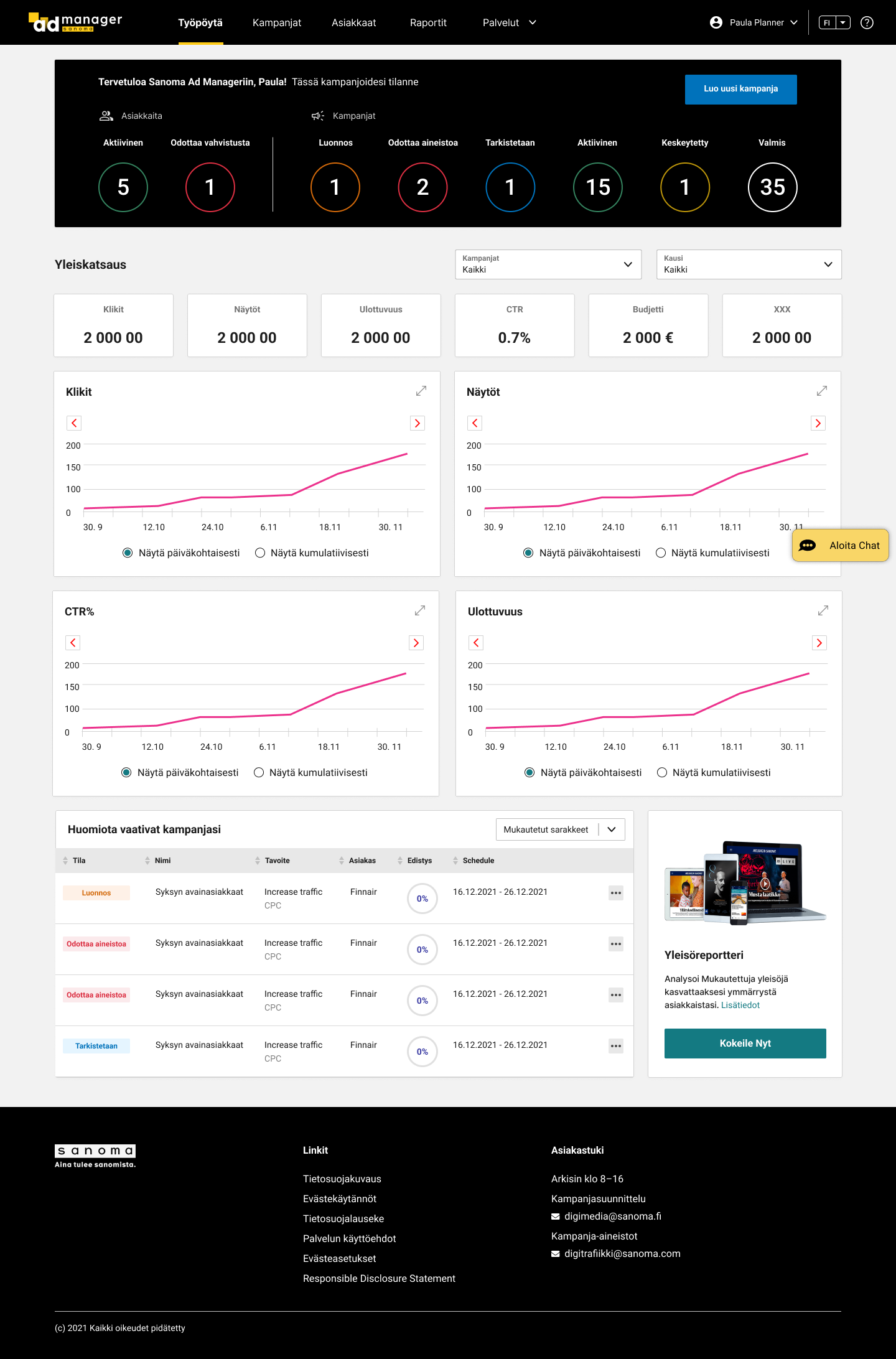
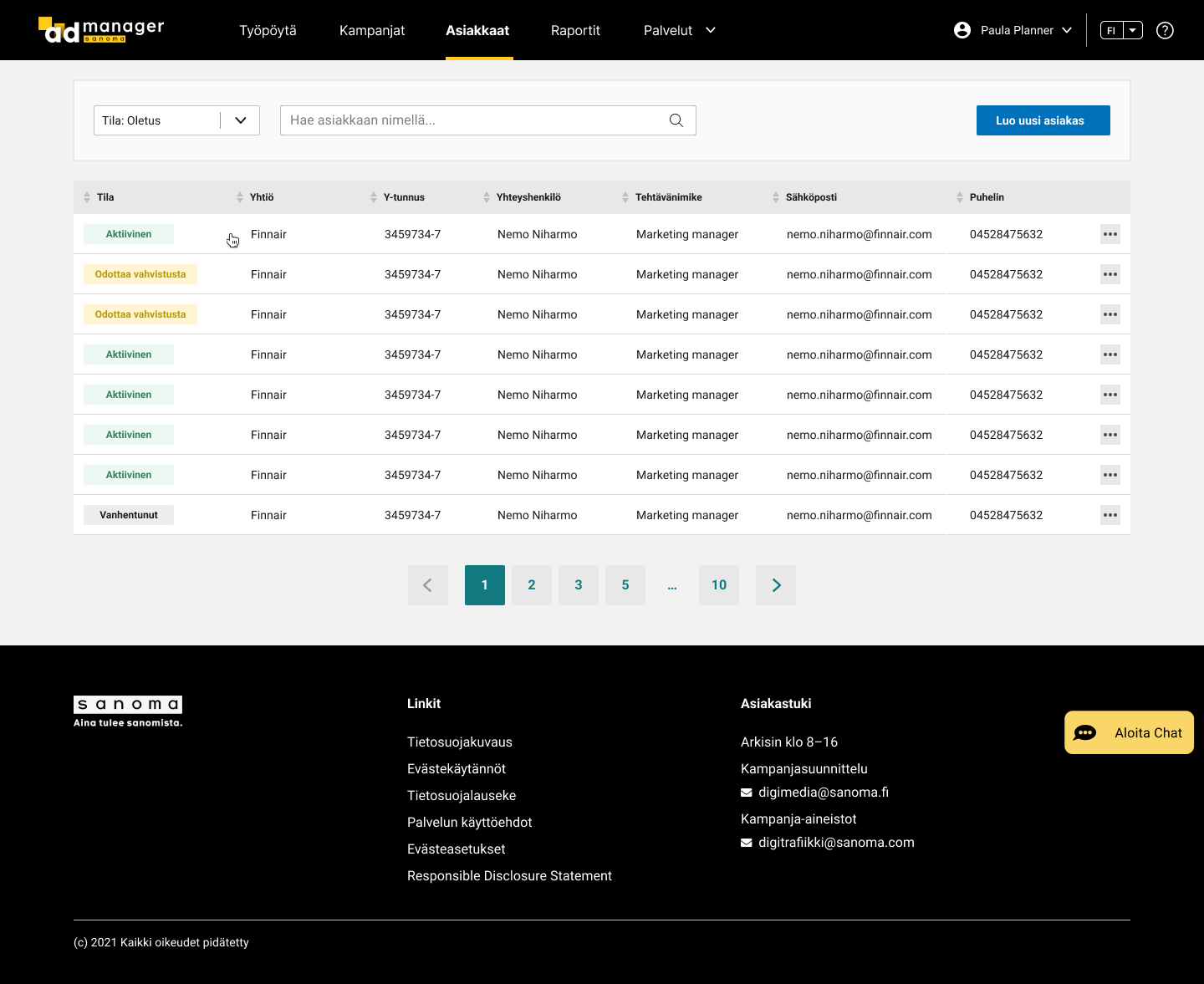
Onboarding pages

What did I learn?
Software too often contains interactions that are top-heavy, requiring extra work for users. The result is software that charges its users a tax, or excise, of cognitive and physical effort every time it is used. The problem with excise tasks is that the effort we expend in doing them doesn’t go directly towards accomplishing our goals. The existence of excise in user interfaces is a primary cause of user dissatisfaction with software-enabled products. For example, when creating an account in Sanoma Ad Manager, users are required to pass Human Verification (i.e., CAPTCHA, Completely Automated Public Turing test to tell Computers and Humans Apart) where they are asked to spend 10 seconds selecting all of the images that correspond with the clue. But this is something we do for the system, not for us, and it doesn’t help us reach our goal – creating an account. Even if we cannot get rid of CAPTCHA in many cases, like ticket selling, we should still try to minimize the work of verification. Google has rolled out a new API, “reCAPTCHA,” that radically simplifies the CAPTCHA experience with just a single click. Another terrible example of account creation in Sanoma Ad Manager is heavy navigation. Users are forced to do many unnecessary, difficult, and disorienting navigation, such as navigating among multiple pages in the Ad Manager and navigating between the Ad Manager and the email software, which is seldom aligned with their needs, goals, and desires.
UX designers should become sensitive to the presence of excise and take steps to eradicate it with the same enthusiasm a doctor would apply to cure an infection.
One principle of mine in designing user experience is to optimize the experience of users when they engage with a product. In the case of productivity tools and other non-entertainment-oriented products, this optimization means minimizing work. User work can be minimized through the four perspectives: cognitive, memory, visual and physical. To reduce cognitive work, UIs should align with users’ mental models so that they can easily understand product behaviors, as well as text and organizational structures. Less recall of data like verification codes, names, locations of data objects, and control, better user experience. As for minimizing visual work, GUIs should tell users how to start on a screen, find one object among many, decode layouts, and differentiate among visually coded interface elements (such as list items with different colors). Last, digital products should not ask for unnecessary keystrokes, unnecessary mouse movements, unnecessary gestures (click, drag, double-click), and unnecessary clicks required to navigate.
