UX&UI / 2017
Designing for navigational experience
Responsibilities: User Research, Data Analysis, Concept Design, Prototyping & Usability Testing
Teamwork with: Mengxiao Li, Tuukka Pykäläinen & Juhani Virta
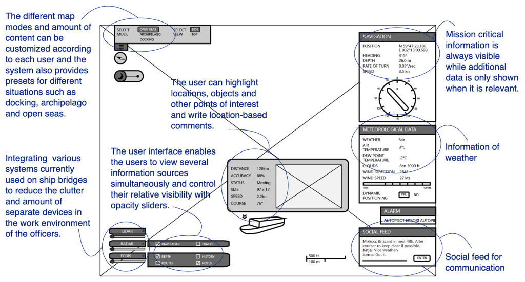
Ship intelligence is an upcoming field that is bound to transform how marine vessels are operated in the future. This project explored the navigational user interface used onboard by designing a navigational user interface for vessels, which builds up a point-cloud-based 3D world of the ship’s surroundings. The UI should be an easy-to-use interface that allows users to view and highlight points of interest, including dynamic and static objects, distances, danger zones, etc.
#Design Process
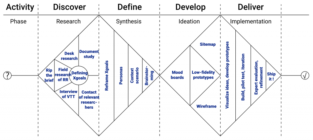
In line with the double-diamond design process, we applied the experience-driven design methodology and combined it with extensive background studies, ideation workshops, concept development, prototypes, and experts evaluation to produce our final design solutions.

#User Understanding
We identified three main scenarios to explore in detail: Open seas, archipelago, and docking. Each one of these scenarios has specific features that separate them from one another, e.g. sailing in the archipelago requires the navigator to be more alert due to the multitude of islands to consider, which makes navigation more demanding. The same applies to the docking scenario, where the captain and crew should concentrate on the distances between the jetty and the vessel.
- Uncertainty concerning the weather and docking conditions at the target harbor
- Collage of various equipment with poor optimization of information
- Having to wait for a connection can cause unnecessary delays in task execution
- Staying connected while out on the sea is a challenge
- Communication gap amongst the captain, bridge personnel, sailors, and the onshore crew.
- Spending a long time at sea can cause loneliness for crew members
- Irregular sleeping patterns lead to less efficiency and more faults
- Nervousness when entering a new harbor

Experience goals based on the user research
#Context Scenario
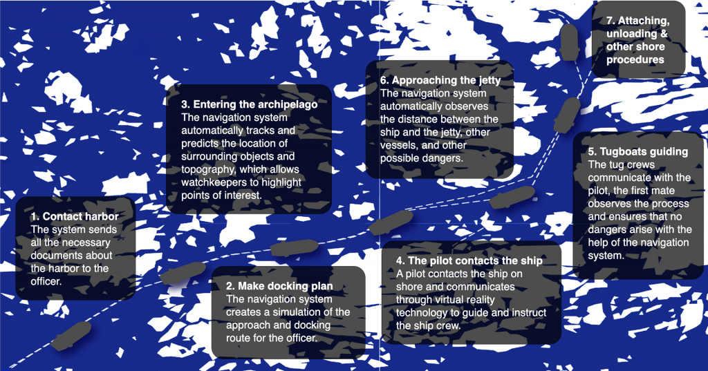
Here we would introduce the 294-meter cargo ship “M/S Boaty McBoatface”, which is on its journey to Turku Harbour, carrying cargo from Rotterdam, Netherlands, the busiest container port in Europe. The 11-day long journey is coming to an end and the ship is approaching the Finnish archipelago.

#Product Concept
How does it meet X goals?

#Experience Evaluation
Evaluating our concepts was difficult due to the fact that we didn’t have any possibilities to contact the end users. Keeping this in mind, we decided to test our concepts on subject experts, who had extensive experience in the field. In this way, we could at least gain some indication of whether our concepts were utilizable and relevant.
- The control of different overlays with sliders was seen as a good idea, as it enhances workflow
- The selection and amount of functions were optimal
- The social features were seen as interesting and novel
- Some captains prefer at least some physical interface elements (buttons, toggles, knobs, etc) instead of the full touch interface, especially in challenging conditions

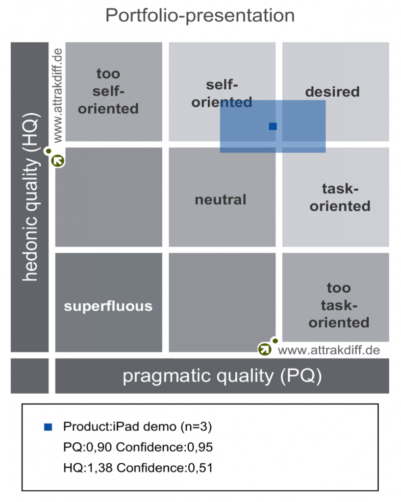
The AttrakDiff evaluation shows that the prototype achieves both pragmatic and hedonic qualities well.
