Design System / 2023
Sanoma Ad Manager: Crafting an Intent-Driven Design System for multi-platform experience
Strategy Planning, Design, Execution, Management and Coaching
My Role
I led design systems efforts for Sanoma Ad Manager across web, mobile, and tablet platforms, including careful planning and execution; coaching team members on topics such as accessibility, semantic integrity of colors and type scale, and implementation of design tokens, etc.
My responsibilities:
- Strategic Visioning: As the project’s lead and orchestrator, I initiated the transformation with an extensive audit of the existing UI elements in the Ad Manager. This laid the groundwork for identifying inconsistencies and areas of improvement.
- Atoms Synthesis: Ensuring a consistent base, I standardized fundamental elements—colors, typography, icons, and more. This role demanded a discerning eye, ensuring every atom was crafted with precision and aligned with Sanoma’s ethos.
- Architecting Molecules & Organisms: From here, I went on to construct larger interface components. This involved meticulously combining atoms into molecules and further into organisms, ensuring each had a clear purpose and was reusable across different parts of the system.
- Prototyping & Templating: As the mastermind of the design evolution, I prototyped templates to represent varying user scenarios. This wasn’t merely about aesthetics but about envisioning and realizing the ideal user experience for Sanoma’s audience.
- Final Design & Rollout: Translating templates into full-fledged pages, I populated them with real content, presenting a vivid, tangible experience for stakeholders. This phase required overseeing the final touches, ensuring all elements were pixel-perfect, and that they provided an intuitive user experience.
- Documentation & Handover: Recognizing the importance of continuity and future scalability, I curated comprehensive documentation detailing the design rationale, component usage, and guidelines for extending the design system as Sanoma’s needs evolved.

The Challenge
Sanoma, a renowned name in the media world, found itself grappling with a concern faced by many businesses in today’s digital era: the lack of a cohesive and efficient design system for its Ad Manager. Sanoma’s previous Ad Manager interface was fragmented. Different parts of the product appeared to have been created in isolation, leading to discrepancies in user experience. Without a standardized design approach, inconsistencies became prevalent, leading to a less intuitive user experience and increased development times.
“A set of shared, integrated patterns and principles that define the overall design of the product.”
Karri Saarinen
Design System Lead @ Airbnb
As I journey through the transformative story of the Sanoma Ad Manager, a quote by Karri Saarinen, the Design Systems Lead at Airbnb, serves as a compass: “A set of shared, integrated patterns and principles that define the overall design of the product.” – Karri Saarinen.
This statement by Saarinen encapsulates the very essence of what the Sanoma Ad Manager transformation was all about. It fits seamlessly into the Sanoma Ad Manager case because it mirrors the journey of transformation — from a disjointed platform to a harmonized, principle-driven design system. It’s a testament to the commitment to ensuring that every piece, every element, no matter how small, plays its part in painting the grand canvas of the product’s design.
Setting the Context with the Brand
Before venturing into the intricacies of the design system, I first took a step back to immerse myself in the Sanoma brand. As Callahan highlighted, a brand is the core communication channel between an organization and its audience. With the Sanoma brand elements firmly in hand—ranging from logos to positioning statements—we ensured that our digital solutions, such as the Ad Manager, would faithfully represent Sanoma in the digital space.
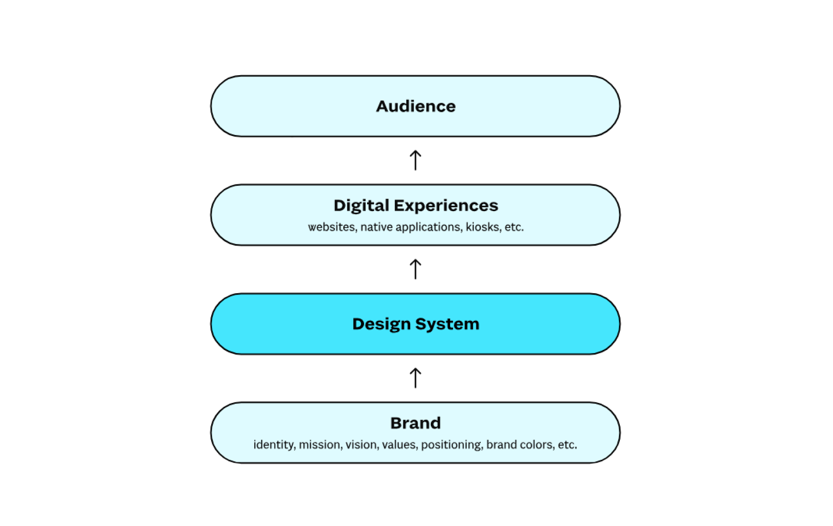
Anatomy of Design System
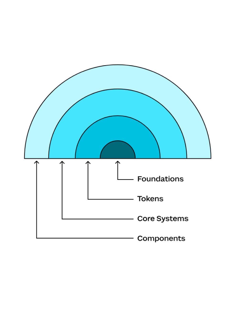
Applying Callahan’s Design System Framework
Foundations Layer:
As the innermost layer, our first step was to delineate the digital brand guidelines for Sanoma Ad Manager.
We painstakingly identified brand elements specific to the digital sphere, ensuring a seamless fusion between Sanoma’s established brand identity and its digital counterpart.
Tokens Layer:
Our next endeavor was to transform the established design concepts into tangible, codified constructs.
By tokenizing Sanoma’s digital brand elements, we created a centralized system that not only ensured consistent brand representation but also streamlined design updates and changes.
Core Systems Layer:
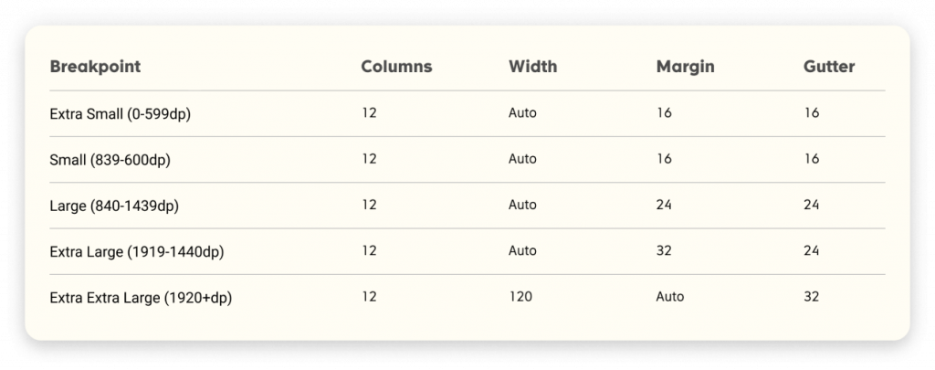
Tackling common interface challenges, we established core systems that addressed layout, type scale, and theme, among others. These core systems were underpinned by our tokenized brand elements, ensuring brand consistency while offering flexible design solutions.
Components Layer:
With the groundwork firmly established, our attention shifted to defining and cataloging reusable interface components.
From basic buttons to complex navigation bars, each component was designed with the preceding layers in mind, ensuring depth, adaptability, and alignment with Sanoma’s brand identity.
Start with intent, not a component
Before diving into the specifics of the components, I delved deep into the brand’s intent — the values it represented, the message it wished to convey, and the experience it aimed to provide its audience. This introspection ensured that our designs, even in their earliest stages, resonated with the brand’s core intentions.
It reminded us that before designing a button, we needed to understand why that button existed. Before determining a layout, we needed to know what experience we aimed to provide.
Exploring Sanoma Ad Manager’s Brand Essence: Stakeholder Interviews & Brand Audits


I coordinated with the project manager to organize a stakeholder interview. Together, we formulated a set of open-ended questions designed to elicit not just factual information, but the stories and emotions behind the brand. These conversations weren’t just about ticking boxes; they were about understanding the passion, dedication, and vision that drove Sanoma Ad Manager.
The marketing team shed light on the brand’s positioning in the marketplace and the challenges and opportunities they foresaw. Their insights were invaluable in determining how the design system could further bolster the brand’s market presence.
Outcomes:
From these two comprehensive activities, a clearer picture of Sanoma Ad Manager’s brand intent emerged:
The goals should be specific, measurable, achievable, relevant, and time-bound (SMART). For Sanoma, the goals include:
– Increasing consistency across all media products and services
– Improving user engagement and satisfaction
– Reducing design and development time and costs
– Improving brand recognition and loyalty
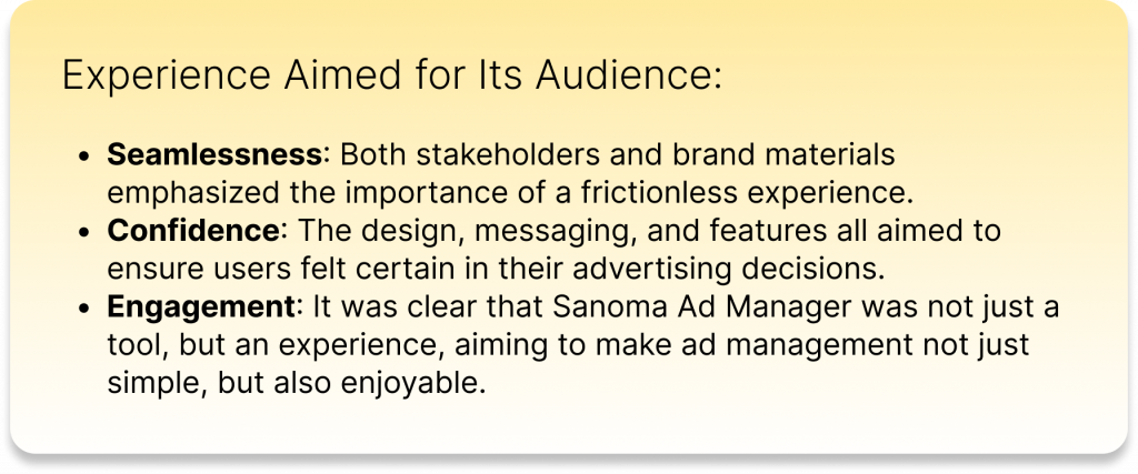
Applying the Design System Framework with Intentions
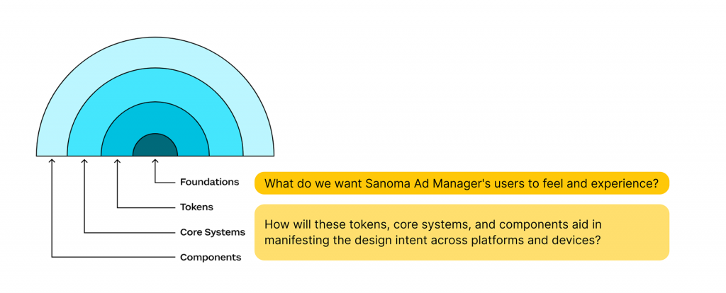
Instead of hastily sketching out interface designs, we pondered on the intent. We want Sanoma Ad Manager’s users to feel and experience the defined values.
This introspective approach led to the identification of digital brand guidelines that were in harmony with Sanoma’s intent, ensuring that every pixel and element was a true representation of the brand’s core values.
Even as we moved into the more technical realm of tokenizing design elements, intent remained our guiding star.
We asked ourselves: “How will these tokens aid in manifesting our design intent across platforms and devices?” By answering this, we ensured a consistent, yet flexible representation of the brand.
Our aim was to overcome interface challenges while staying true to our initial intent. Whether it was the layout or theming, each core system was a reflection of the initial design intent, ensuring that the brand’s essence was never lost amidst technicalities.
Now, with a firm foundation and clear intent, we ventured into defining components. Every component, no matter how minute, was created with a clear understanding of its role in fulfilling our overall design intent.
This ensured that components weren’t just functional elements but also carriers of the brand’s message and values.
2. Development Elevation: Reduction in Development Time for New Features.
3. Consistency Chronicle: Reduction in Design Inconsistencies.
4. The Stakeholder Sentiments: Positive Feedback from Internal Teams.
In collaboration with the Project Manager, we meticulously defined key metrics to gauge the success of the Sanoma Ad Manager’s Design System. Recognizing that user-centricity was paramount, we prioritized reducing user errors and support tickets, as a surge in such tickets often strained resources and eroded user trust. Furthermore, understanding that streamlined development processes directly impact cost-efficiency and adaptability, we highlighted the need to curtail the development time for new features. As the essence of a design system lies in consistency, we anchored our success in minimizing design inconsistencies, ensuring a seamless and trustworthy user experience. Lastly, we value the voices within our organization. Given that internal teams often serve as a system’s preliminary users, their feedback was crucial. We initiated feedback loops across Sanoma departments, seeking to ensure the design system not only met but exceeded internal expectations, serving as a harbinger of broader user satisfaction.
Building the Design System
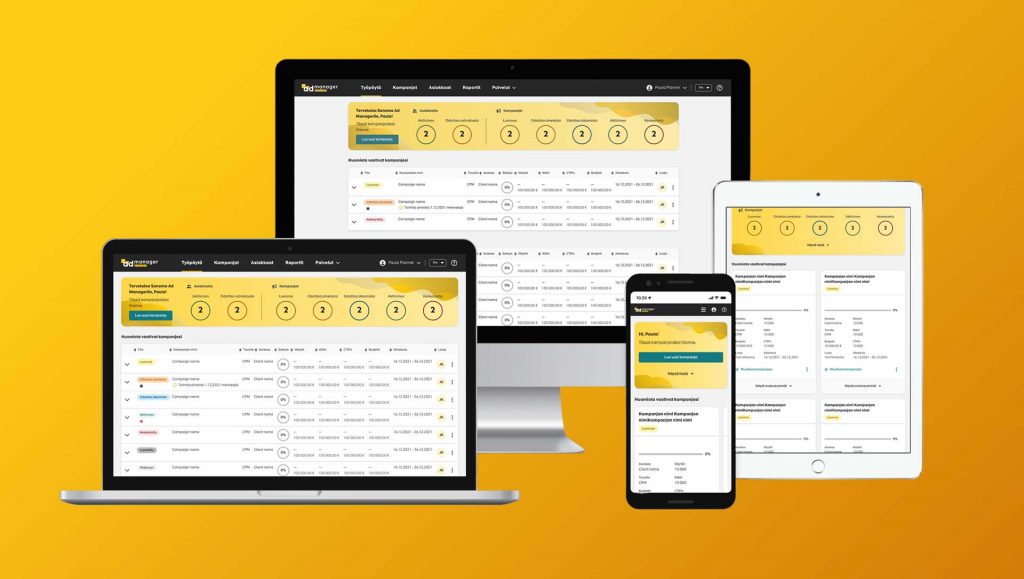
Avoid over-reinventing the wheels
Sanoma Ad Manager wasn’t a fresh slate. Its design has been in place, serving its users, and while it didn’t have a structured design system supporting it, its existing design was functional and familiar to its users. Completely overhauling the design was not only potentially detrimental to user familiarity but also a hefty cost proposition for the client.
The most significant challenge was finding that sweet spot – the balance between creating a more structured and efficient design system without making sweeping changes that would disrupt the user experience or cost our client in terms of time and resources. The key was to be able to differentiate between what needed to be retained and what needed to be enhanced or reimagined.
The goal was twofold:
1. Identify components that fit seamlessly into the envisaged design system and were consistent with the desired user experience.
2. Spot components that were outliers – those that either did not fit the desired system in their current state or could be optimized further for better usability.
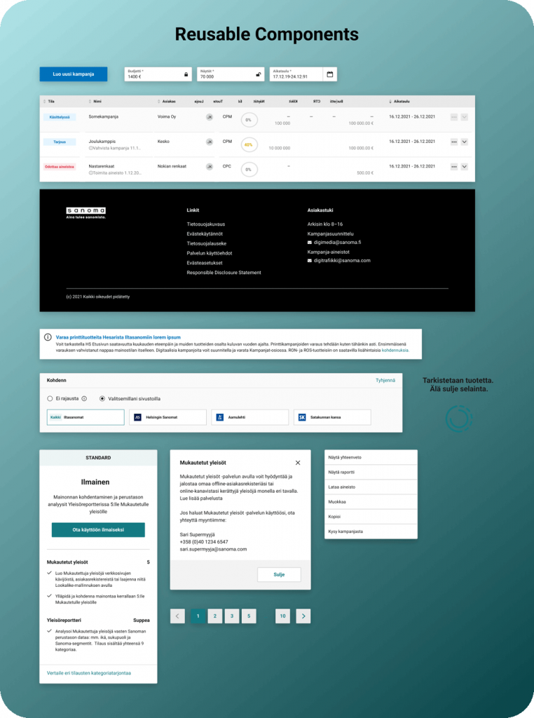
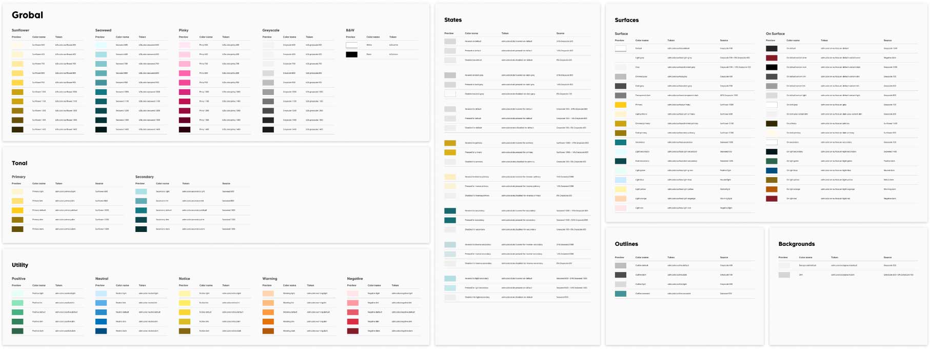
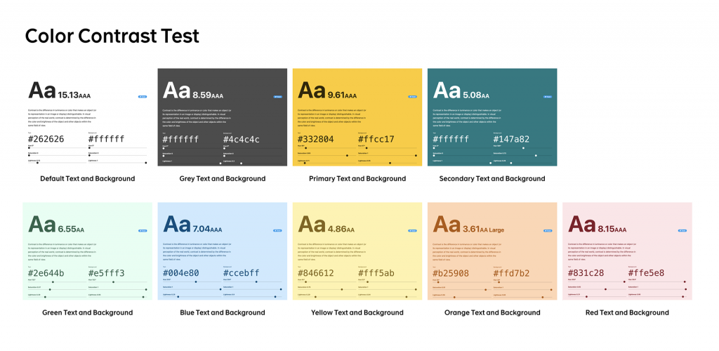
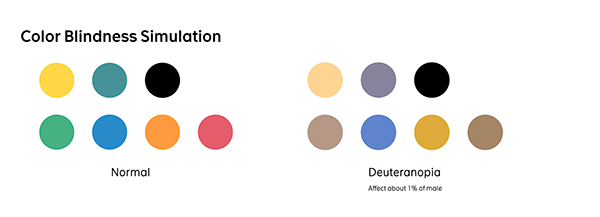
Develop a style guide
A style guide is a comprehensive document that outlines the visual and functional standards for your products or services. This should include rules for typography, color, imagery, layout, and more.
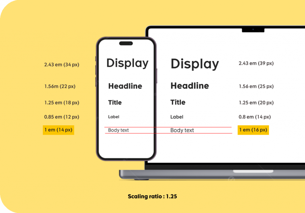
Create a pattern library
A pattern library is a collection of reusable UI components, including buttons, forms, menus, and more. These components should be designed to work together seamlessly and follow the guidelines set out in the style guide.
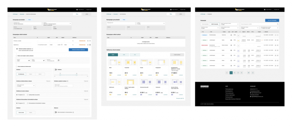
Atomic Design
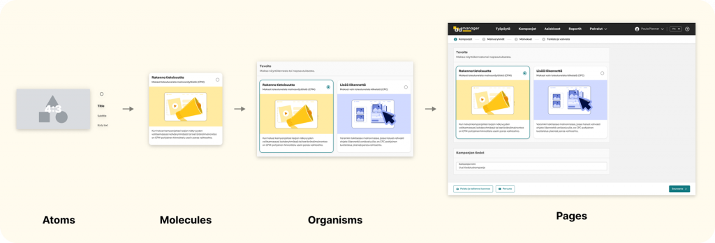
Atomic Design, a term coined by Brad Frost, takes inspiration from chemistry, viewing interfaces as a hierarchy of components. It’s built on five distinct levels:
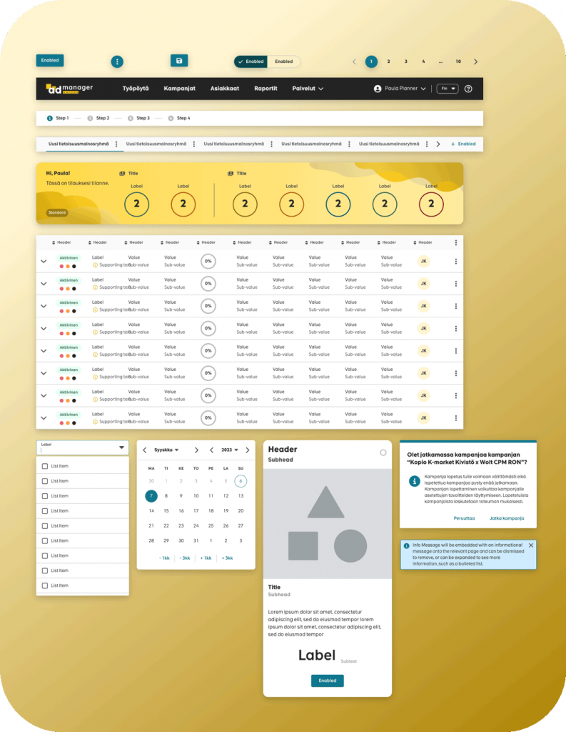
Atoms: The primary building blocks, representing native HTML elements like buttons, input fields, or labels.
Molecules: Assemblages of atoms that function together as a unit. For instance, a search input (atom) combined with a search button (atom) constitutes a search form molecule.
Organisms: Complex UI sections made up of multiple molecules. Think of a site header featuring a logo, primary navigation, and a search form.
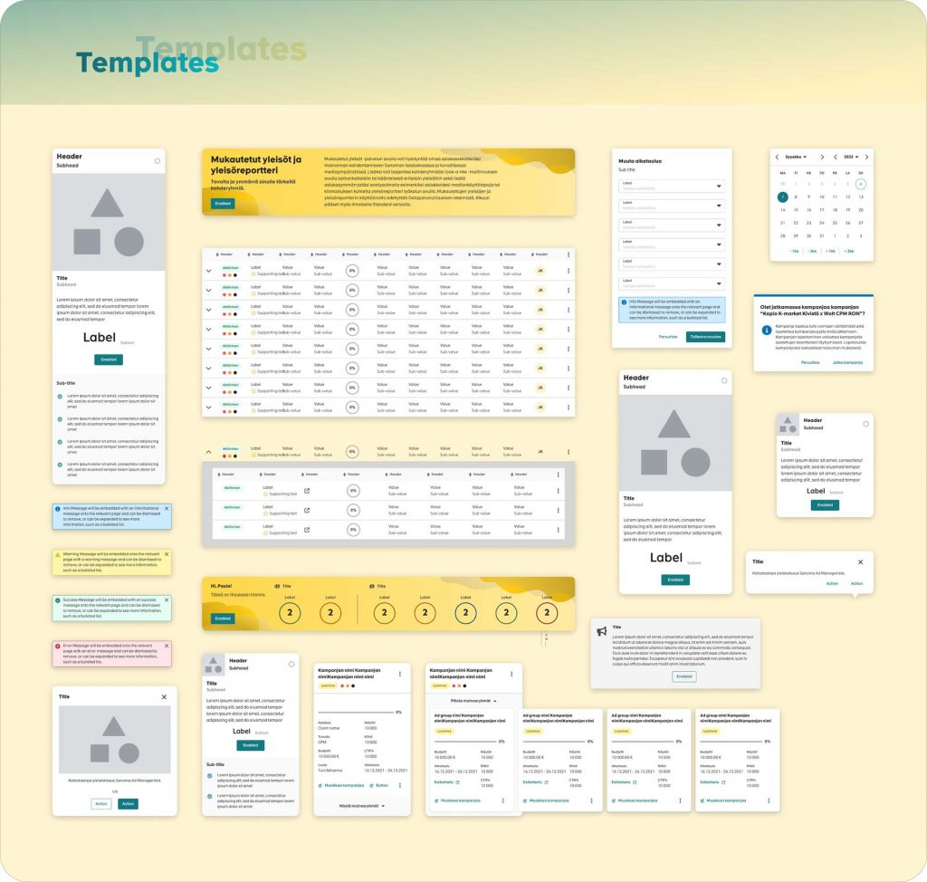
Templates: Page-level objects that articulate the layout’s structure by placing organisms into a design’s context.
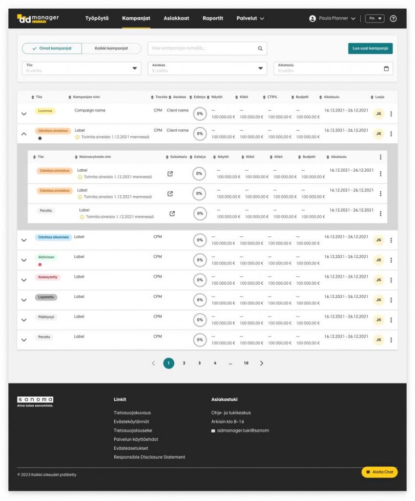
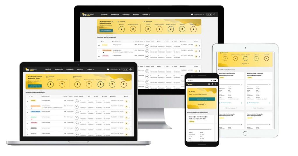
Pages: Instances of templates, showcasing real content in the designated layout.
The first step involved creating atomic-level elements, such as standardized colors, typography, icons, and buttons. These foundational atoms served as the building blocks for consistency throughout the system. Moving forward, I combined these atoms to form larger interface components known as molecules and organisms. Each molecule and organism was designed with purpose, ensuring they were reusable across the application and aligned seamlessly with Sanoma’s branding guidelines. This approach not only enhanced design efficiency but also promoted a unified user experience. Finally, to provide stakeholders with a tangible vision of the end product, I populated templates with real content. This allowed for a vivid representation of how the design system would function in a real-world context, helping stakeholders visualize the final user experience and ensuring that the Sanoma Ad Manager’s objectives were met effectively.
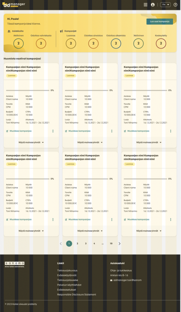
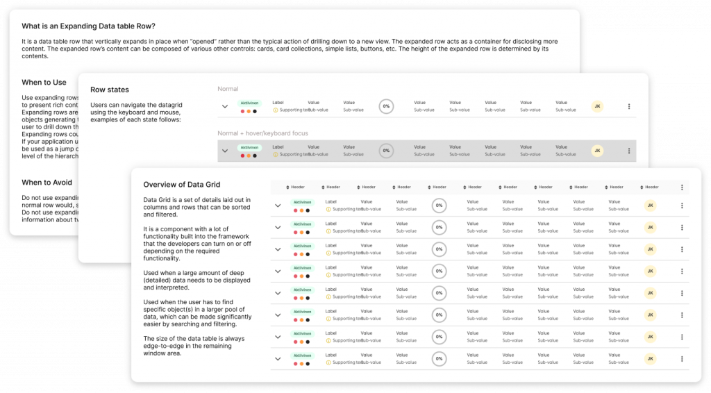
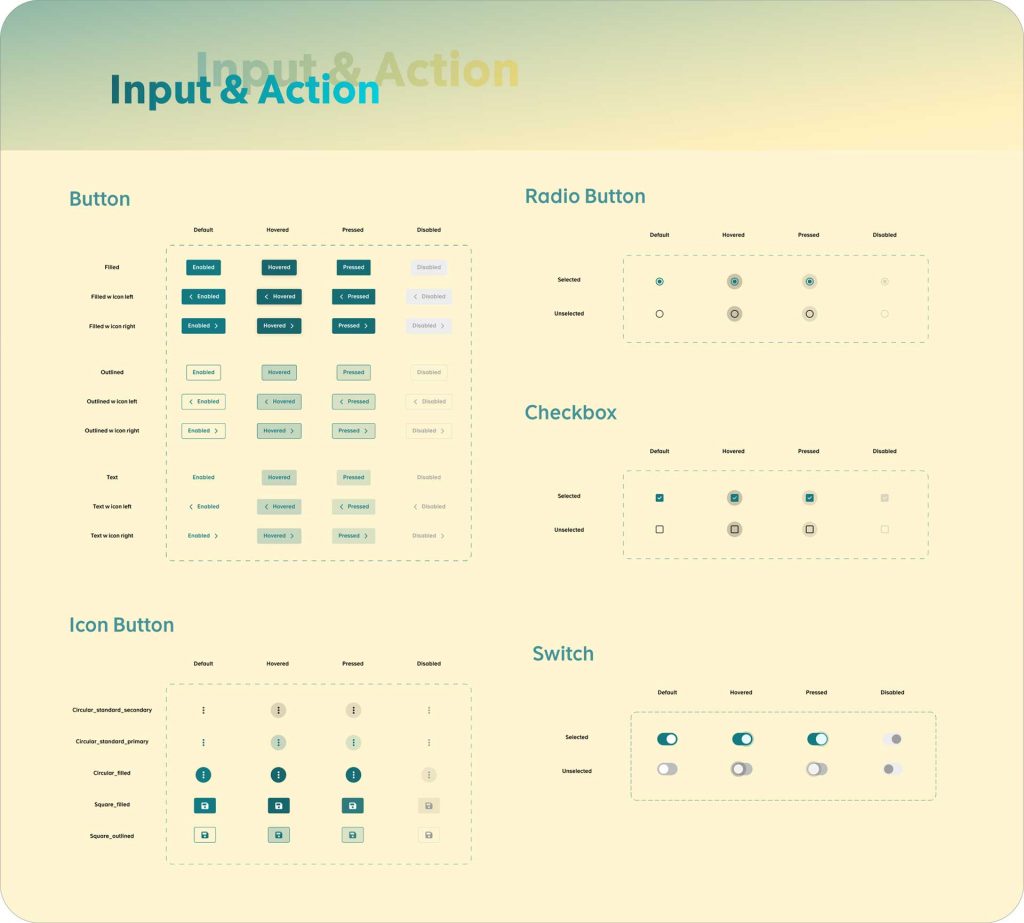
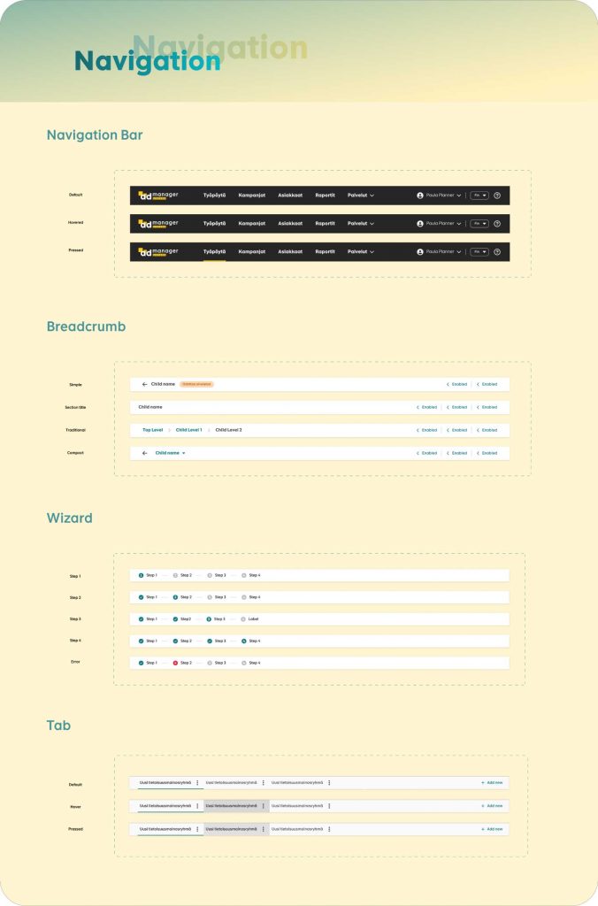
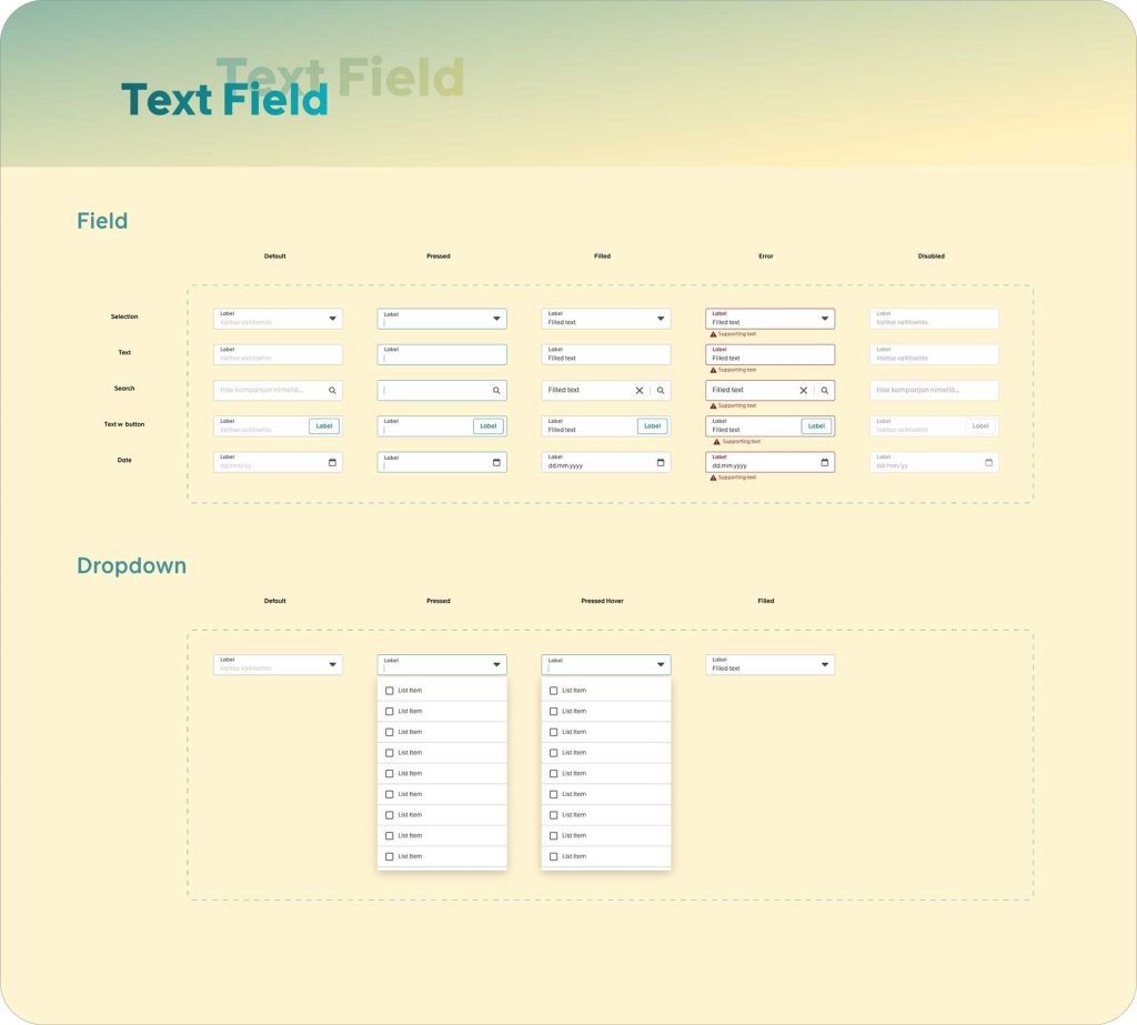
Selected components and templates
Measuring Success

What did I learn?
At the outset, I recognized that the conventional component-first approach would be akin to putting the cart before the horse. Instead, the project was steered by the philosophy, “start with intent, not a component.” This intent-driven design methodology required a profound understanding of the core values, message, and experience that the Sanoma Ad Manager aimed to impart. By leading with intention, every design decision could trace its roots back to the foundational aspirations of the brand.
Understanding the Brief and the Balance: The first step in any project is to completely understand the requirements and scope. The client’s mandate was clear – they did not wish for a complete overhaul of the existing design. A full redesign was not only potentially costly in financial terms but could also cost user familiarity and brand consistency. This put things into perspective for me, highlighting that our design system would need to function more as a bridge between the old and the new, rather than a breakaway.
Delving deep into stakeholder interviews, the intricate tapestry of Sanoma’s vision was unraveled. These conversations were instrumental in unveiling nuances that might have otherwise been overlooked. Each thread of insight – be it the paramountcy of trustworthiness or the commitment to pioneering innovation – influenced our design direction. Coupled with brand audits, this initial reconnaissance ensured that the system we were building was not merely aesthetically pleasing but resonated with Sanoma’s very DNA.
Auditing and Documentation: The critical phase was auditing the current design components. This was like a treasure hunt, where we had to sift through the design debris and locate gems that could be retained and polished. Each component was carefully evaluated against criteria like usability, visual appeal, and adaptability. Documenting each element’s purpose, usage, and variations became crucial at this stage. It gave us a clear blueprint of what existed, what could be enhanced, and what needed redesigning.
The application of intent-driven design made the system innately more user-centric. Instead of retrofitting user needs to preconceived components, designs were molded around genuine user challenges and aspirations. This, I believe, was a cornerstone in achieving the staggering 60% reduction in user error tickets. Such tangible outcomes were not just metrics but endorsements of the methodology.
While the project’s success, evident in reduced development times and enhanced user experience, is gratifying, the deeper lesson lies in the methodology’s reaffirmation. The Sanoma Ad Manager’s Design System became a testament to the power of beginning with intent. It underscored the notion that when designs are anchored in genuine understanding and purpose, they transcend mere aesthetics, evolving into tools of empowerment, clarity, and innovation.
Collaboration and Feedback: Collaborating closely with stakeholders was pivotal. Regular feedback loops ensured that we were on the right track. By involving them in the journey, we could strike the right balance between maintaining the existing design’s core and introducing necessary enhancements.
In retrospect, this project wasn’t just about building a design system; it was about sculpting a narrative, a narrative where every pixel tells a story, every interaction evokes an emotion, and every user feels seen and understood. The Sanoma Ad Manager’s Design System is more than a design triumph—it’s a clarion call for intent-driven design methodologies in an age of digital transformation.
Conclusion: The development of the Sanoma Ad Manager’s design system became an exercise in balance and restraint. It taught me the importance of respecting legacy while gently pushing the boundaries to ensure modernity and functionality. This journey was less about reinventing the wheel and more about refining it for a smoother journey ahead. The result? A design system that not only retains the essence of Sanoma Ad Manager but also provides a more structured and scalable foundation for its future growth.
