UX&UI / 2021
Food Service Offering (FSO) Concept Design
Responsibilities: Concept Design, UI Design & UX Evaluation
The Challenge
Stora Enso’s Food Service Offering (FSO) is getting bigger and bigger as the market for food on the go is rising. In preparation for the “Stora Enso cross-divisional offering for Food Services,” there was a need to understand the offering and end-uses. Considering the customer demands, FSO aimed to simplify the communication within Packaging Material Division and be able to provide a strong, straightforward offering to customers. However, getting started was easy as I was confronted with scattered customer insights (background documents) that were necessary for me to understand the context and a tight deadline. Baking research into the design process was a daunting challenge as the customer requested a complete solution within four weeks. The customer expected to see some early product concepts a few days later after the kickoff.
My Role
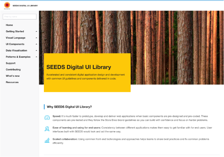
As a lead UX Designer, I started with hypothesis design to efficiently find out what should be built and why by making and evaluating assumptions, and clearly communicating the vision, priorities, and overall solution concept. After that, I designed the user experience using the feature, which provided input to estimate the ROI of solution options (business value vs. effort to build the solution) and gave developers an early understanding of the desired user flow and design to help plan the development. During design collaboration, the user interface design was further fleshed out for all scenarios by me. Collaborating with a researcher, we reviewed and inspected the UIs with the end users to ensure the design meet the quality requirements. I finalized the design visually in close collaboration with internal designers. The validation happened across the whole process. I collected feedback through light sessions, like Q&A through quick calls, simple chats, commenting tools, or very serious feedback sessions like user testing.

Therefore, I adopted a hypothesis-driven design approach where I designed solutions and test them with stakeholders/users, and advanced my understanding and business solution through design…
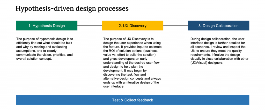
How to create value for the customer through hypothesis-driven design?
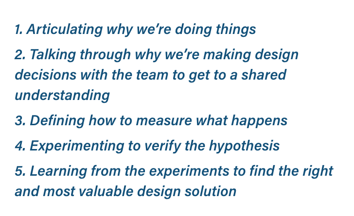
1. Hypothesis Design: Explore & Define
Make and evaluate the hypotheses for the following design questions ...
“We believe that [creating this] for [users] will achieve [this outcome].”
Product design goal
The overall goal is to provide a Simple & Fit-for-Purpose Single-Platform FSO Solution that match-makes customer criteria to the offered products at Stora Enso.
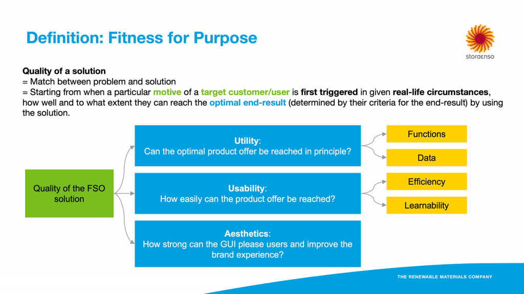
Criteria for success that tell if my hypothesis is good enough (leading indicator)
“We’ll know that this is true/false when we see this [key performance indicator change].”

2. UX Discovery: Ideation & Evaluation
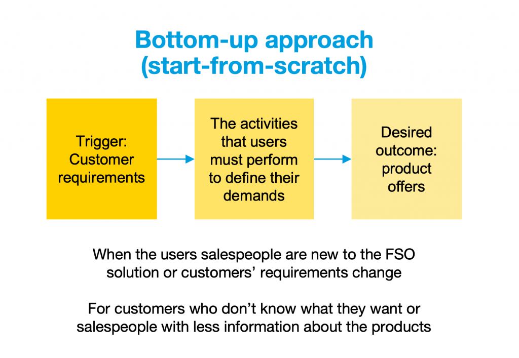
How to find a product offer: bottom-up approach & top-down approach
Optimize the user experience for different user groups
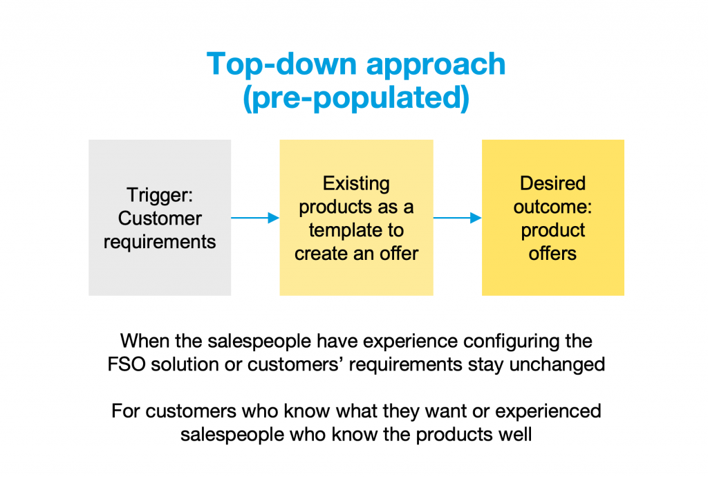
Early concepts
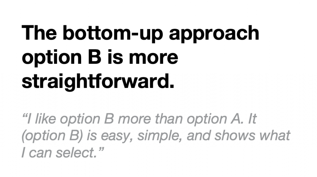
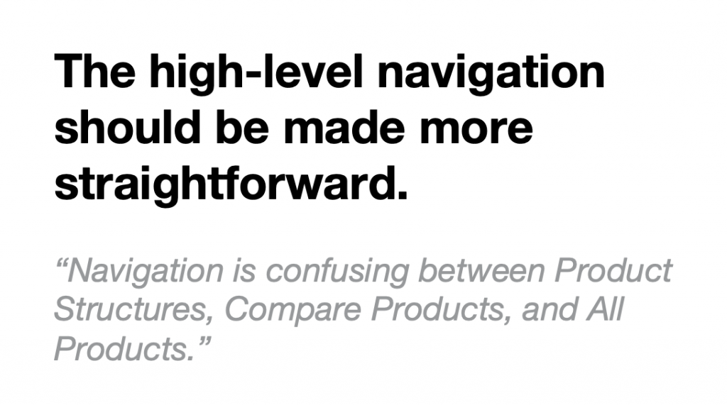
UX evaluation
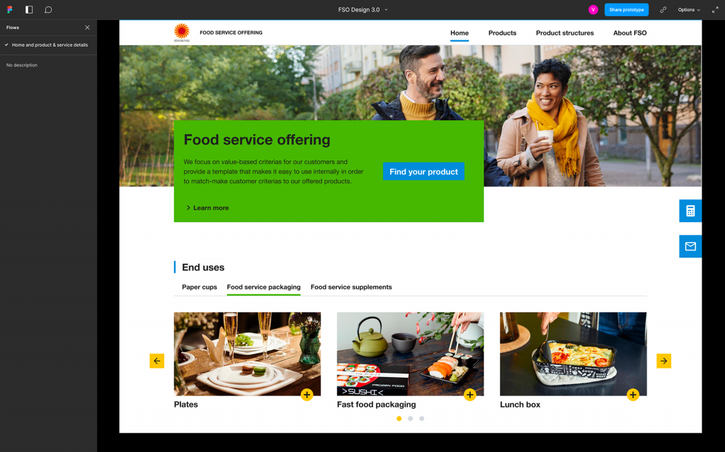
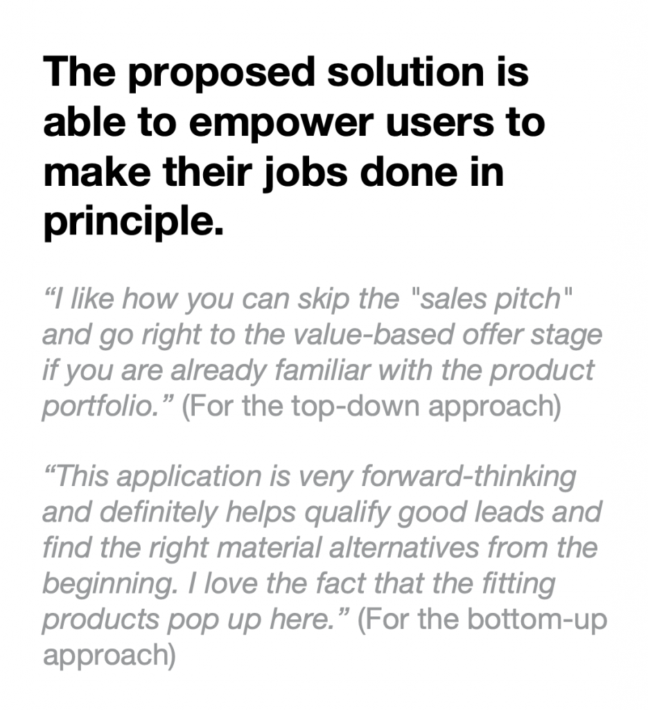
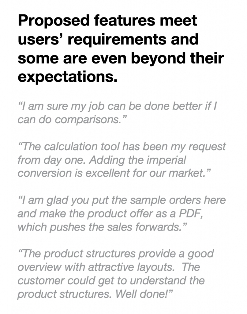
3. Design Collaboration: Iterative Design
UI Design
Final Design
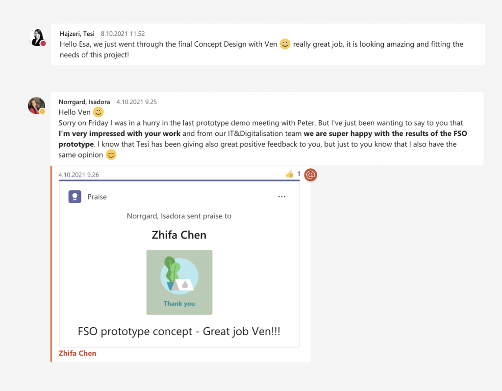
Impact
#Reflection
User testing in this project was done by a dedicated researcher exploring the quality of the solution through three aspects: what is clear, what is unclear, and if there is something important missing. It was good to have this feedback, but this feedback wasn’t enough, or couldn’t 100% tell the success of the solution. As I have previously defined the success metrics, like the calendar time and total effort for the users to find a food packaging offer, the quality of the design solution through Fitness for purpose: a) can the optimal product offer be reached in principle; b) how easily can the product offer be reached; c) how strongly can the GUI please users and improve the brand experience. Those were not intentionally measured. The measurement work could be done better if considering more about the context. So I would suggest in the future the UX designers should also participate in the usability test planning together with researchers to bridge the user testing strategy and the UX metrics if there are dedicated researchers assigned. Last but not least, it would be better to have more metrics, like user satisfaction rating, ease-of-use rating, task success rate, time on task, error rate, and productivity) as testing results instead of just subjective feedback, which could also better present the impact of the project, doesn’t it.
