UX&UI / 2021

DesignHub: Designing for Empowering Communication Service Providers (CSPs) to Design Services more Efficiently

Responsibilities: User Research, Concept Design, UI Design & UX Evaluation

The Challenge

To be able to offer tailored slice-based services, Communication Service Providers (CSPs) need to be able to design services efficiently at scale. However, as the complexity of the business environment and the networks is growing, the current siloed service design tools and processes that are designed for more traditional static telco services are extremely complex and overlapping, which makes it difficult and time-consuming to build new services.

As a core component of Nokia Digital Operation Center, DesignHub is cloud-native software for CSPs to design digital and slice-based services.

My Role​​​​​​​

As one of the lead UX Designers for the DesignHub project, I participated in the project development from the kickoff meeting to the product release and multiple rounds of iteration afterward. I was responsible for customer research, value proposition design, and early concept design. I then created the UI design and conducted a corresponding UX evaluation, which laid the groundwork for subsequent iterations. This was the start of something big. 

OSS is an industry that’s undergoing constant, and massive change. But it still hasn’t been disrupted in the modern sense of that term. It’s still waiting to have its Uber/AirBnB-moment, where the old way becomes almost obsolete by the introduction of a new way. OSS is not just waiting, but primed for disruption.

- Ryan Jeffery

Principal Consultant, Infosys, PassionateForOSS.com

#Think

Contextual Inquiry

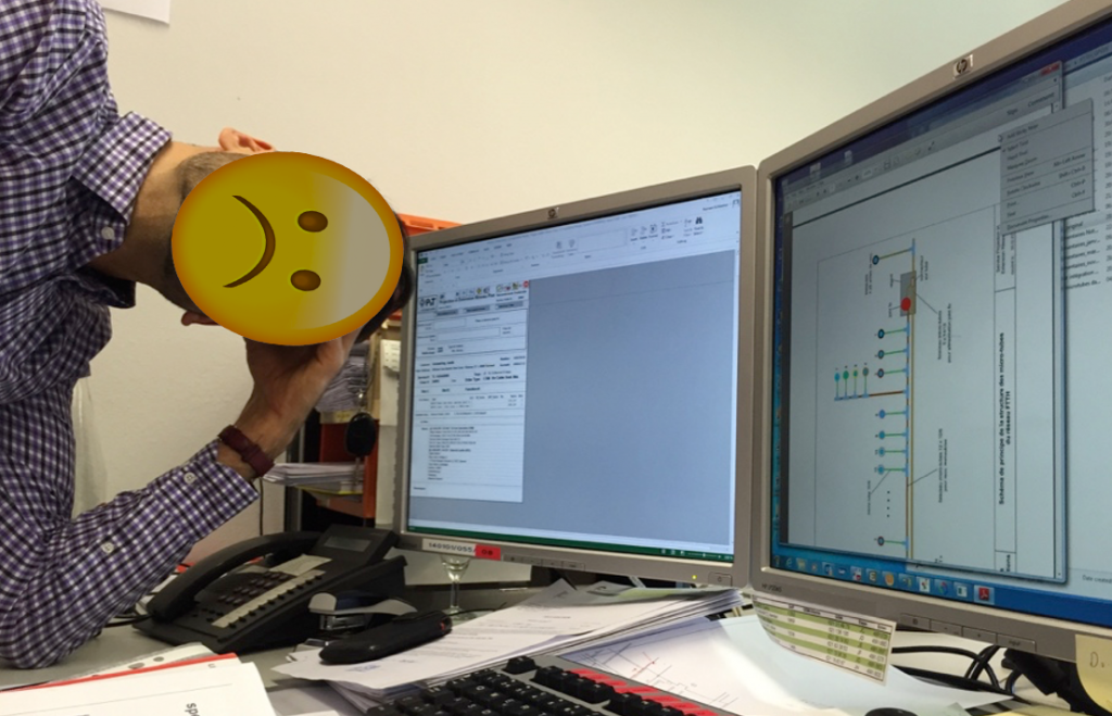
To design a good solution, the first step is to understand the problem you’re solving. I conducted a set of contextual interviews with Nokia solution architects and delivery engineers who worked on service creation. I observed and listened as they worked. They demonstrated current service creation tools and walked me through the current process of service design and pointed out the problems they were facing.

#Key Findings
1. Huge complexity: over 10 different systems/UIs that the same user must use to complete service creation (many unnecessary actions, copy-pasting, and navigating between technical modules).
2. Many separate products that do similar things in their own way, with different data models, different workflow engines, UIs, etc.
3. Large support and maintenance costs, and low productivity in operations.
4. Software is designed inside-out: starting from technology instead of customer problems
Stakeholder Interviews

Investigating problems of the current processes did not mean the customer needs were revealed. To better understand customers’ requirements, I conducted 11 interviews with product managers, solution architects, and technical leads in delivery teams. 
 
#Key Findings
1. Build new services rapidly 
2. Define the service composition in a declarative manner
3. Use standards compliance to scale services up 
4. Publish the service so that the client systems order
5. Manage the service through the whole lifecycle
Product Design Vision Creation

Based on the identified problems, the next step is set to structurally reduce complexity. Starting from the customer experience and working backward to technology, we aim to design a fit-for-purpose and complete service design solution where target customers/users can reach their desired results in their real-life circumstances from the first trigger to completion.

Co-creation Workshops
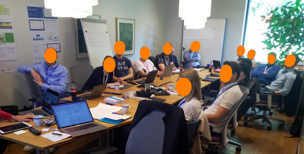
This project drastically affected multiple different areas of the organization, which at times had conflicting interests. I set up and facilitated two-day co-creation workshops with representatives from Architect, Engineering, Marketing, Pre-Sales, and Product Line Management to holistically evaluate the proposed product vision, identify triggers and user personas of service design, and create the ideal service design journey.
​​​​​​#Triggers
Together with the participants, we successfully defined all the possible triggers from the customers requesting service creation tools. By identifying the customers’ complete set of needs, we could know what R&D investments to make to create an ultimate platform-level solution, which provides us with a long-term vision of where it needs to go.
#Persona
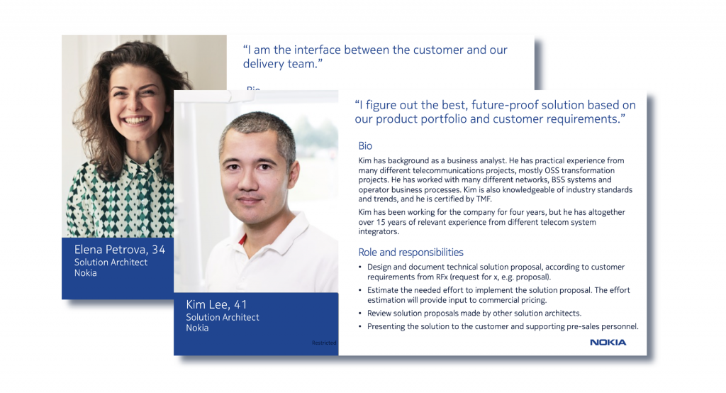
Based on the feedback and insights about service design users given by the workshop participants, I created personas to make sure the product development team is on the same page in understanding user needs and requirements. 


#User Journey
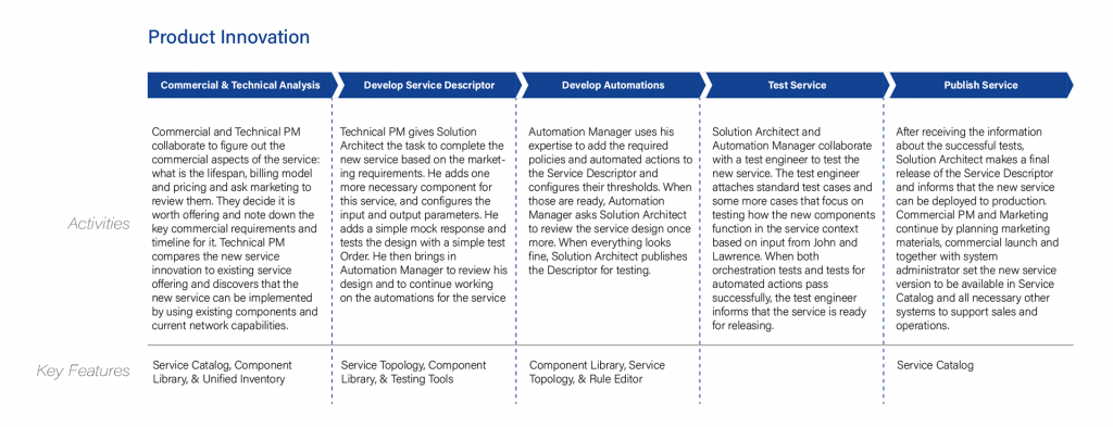
By mapping the user journeys for the key scenarios, we established the ideal process of service creation. We worked out how users are going to interact with the system and what they expect from it when designing services. In the meantime, we identified possible features at a high level by understanding the key tasks.   

Success Criteria

#From the Front-End/UI’s perspective
1. Self-explanatory and efficient UI for service design
2. Good overview and drill-in view for service details
3. Minimize time from new Product idea to the start of marketing (Minimum number of necessary actions to complete typical tasks end-to-end)
4. Quick access for viewing and managing Services and components for creating new products and understanding how they can be combined
#From the Back-end and Solution Architecture’s perspective
1. Minimum overlaps of servers/modules/components
2. Minimize lines of source code (product and CSP-specific solution)
3. Able to test BSS/OSS integration and run automated test

Concept Design & Validation

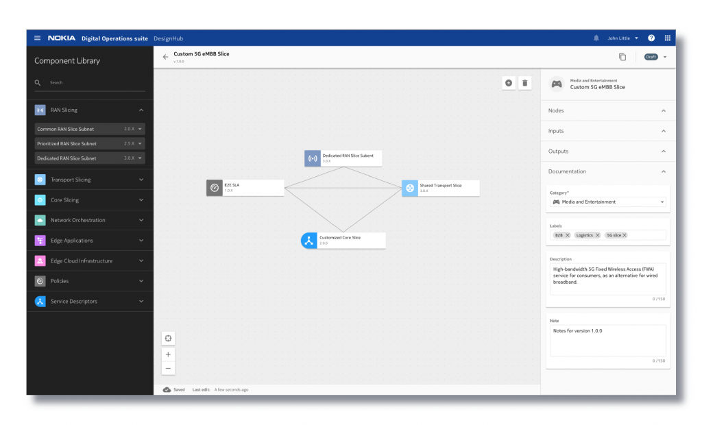
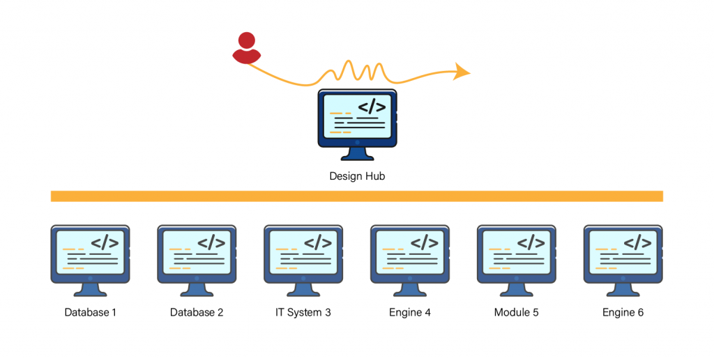
Based on the research insights, I proposed DesignHub, a consolidated user interface to create, modify, and manage services at a high level without caring about implementation by combining existing service components quickly and efficiently within standard compliance (e.g., TOSCA language).
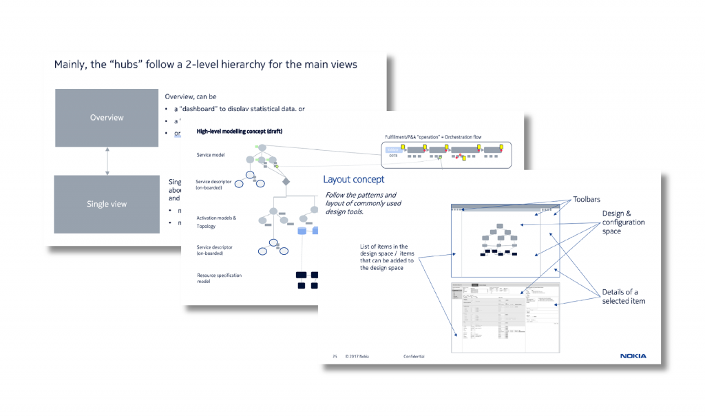
1. DesignHub should enable users to control versions, like creating a copy of an existing service and modifying the copy to create a new service or a new version of the previous service.
2. DesignHub should enable users to control the lifecycle of the service from draft to obsolete.
3. DesignHub should provide test automation, continuous integration & deployment in different environments.
4. DesignHub should allow users to publish services for the business-facing systems.
 
After the UX concept is formed, I validated it with the users (solution architects) through quick sketches. The concept, in general, was highly agreed upon by the users. I collected some further feedback to improve the concept. 

#Make

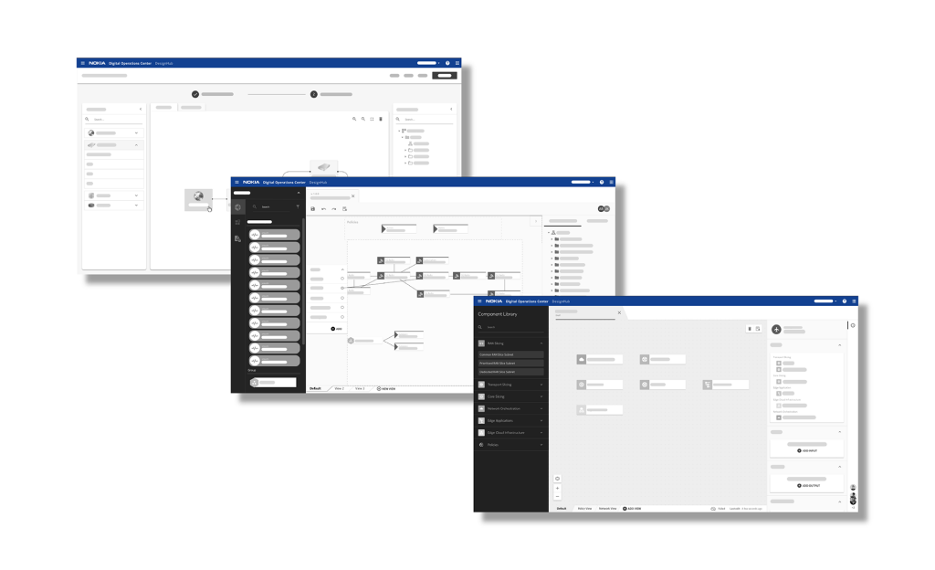
Wireframes

Once we had a solid direction for the design, I began to produce multiple different variations of wireframes. I then put the designs in front of users and internal stakeholders for testing and feedback. This helped me to narrow the design down, which I used to establish a single design framework, and thus move into visual design.
Mockups
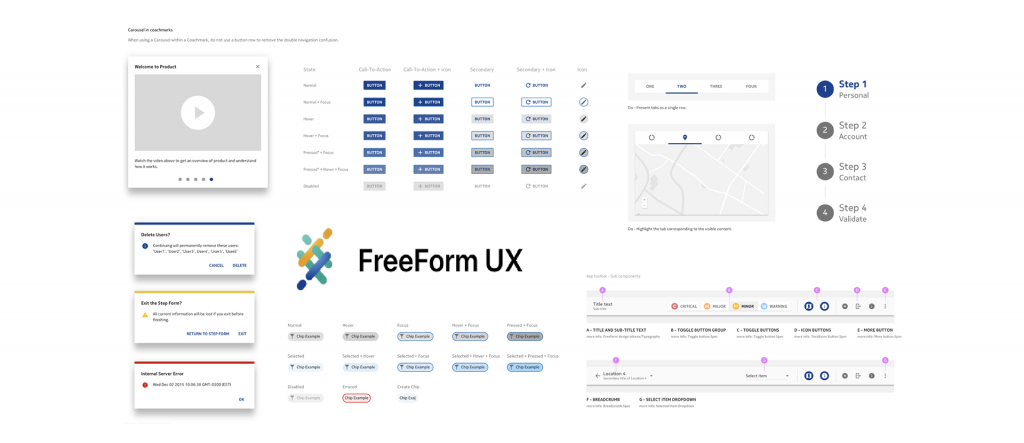
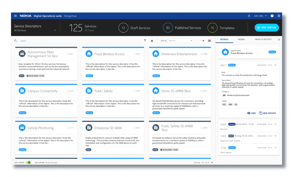
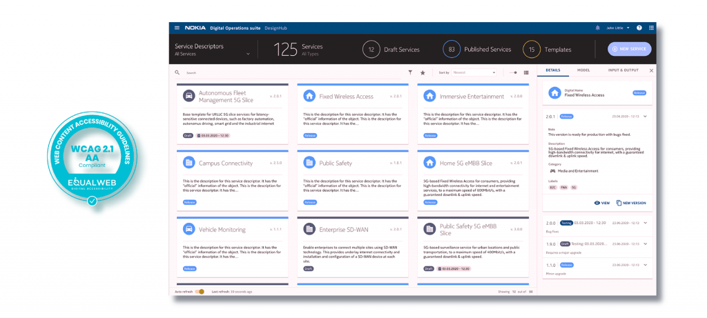
During the visual design phase, I created visual design including colors, shapes, signs, symbols, charts, tables, graphs, models, maps, animations, typography, etc, by using components from FreeForm UX (i.e. Nokia Design System), which built a common visual language through Digital Operation Center ensuring a seamless experience.
 
However, FreeForm UX components couldn’t support all the designed features. I have created some new components like canvas and topology builders. All the new elements were integrated into FreeForm-UX’s next-generation design system and distributed via our UI Library and a master Sketch file. The working examples were displayed with code snippets and instructions for design and use. As a result, the design was more ubiquitous, consistent, scalable, and efficient.

Accessibility

Accessibility was crucial to DesignHub. The design, like the use of color, needed to pass Web Content Accessibility Guidelines 2.1 making it accessible to people with disabilities. Besides, I tested the design for multiple forms of color blindness.


Test

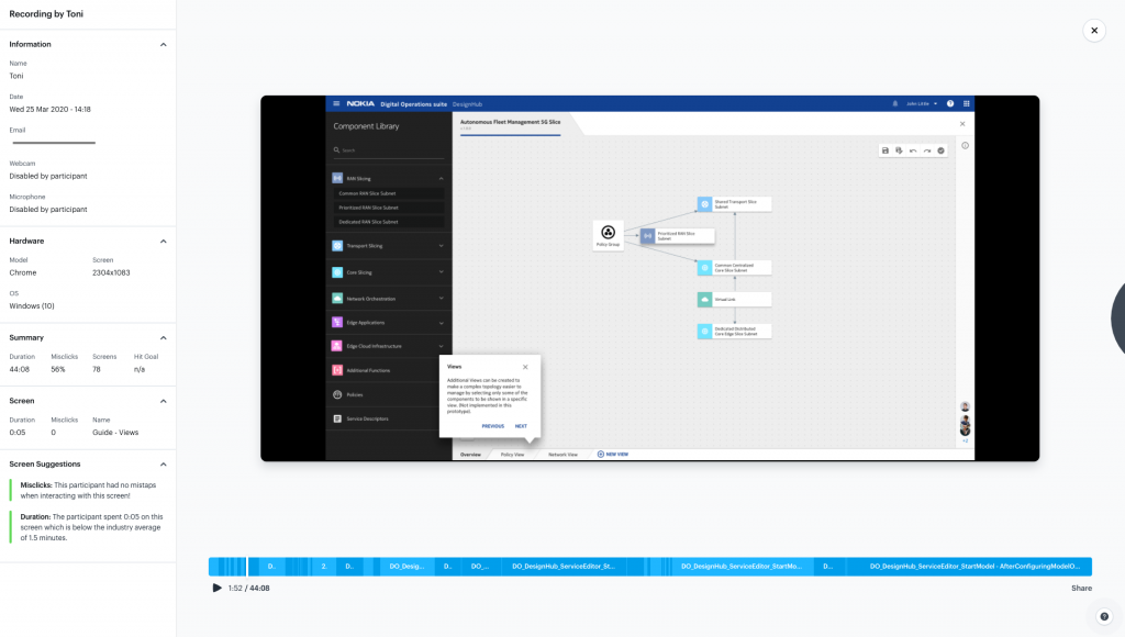
With the design live, I recorded users on the site and ran several rounds of user testing. This really helped in giving us feedback and ultimately incorporating it into future iterations of the design. This information was used to prioritize the most important items for the next iteration. Screen recordings were used to immediately assess the design. In this case, I was watching how an existing user used the software.
 

Release!

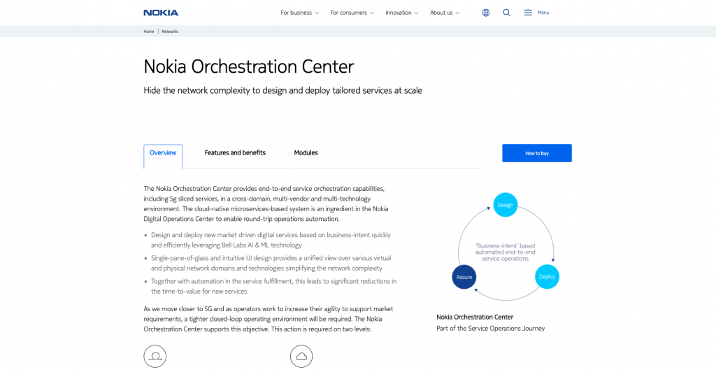
In an awesome moment, we released the Digital Operation Center to innovate the telco industry!

#Check

Impact

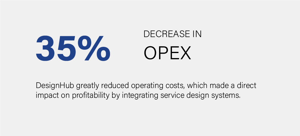
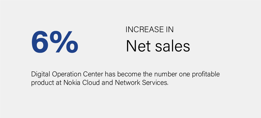
It was extremely rewarding to work on a project that generated such a great impact on the telco industry. DesignHub brings higher solution value to CSPs and drastically increases productivity and agility., which leads to higher revenue. Since launching in June 2020, Nokia’s Digital Operations Center solution has been selected to support numerous projects globally by CSPs and other industry partners that are building NaaS platforms that span their existing network infrastructures, in conjunction with their build-out of 5G networks. Digital Operation Center also won the 2020 Fierce Innovation Award and the FutureNetWorld Orchestration Solution Award.

#Reflection

This was an extremely challenging project with a high impact. A lot went right, but as with any project, things also went wrong. I like to reflect on the successes and failures of every project so that I can learn from them and apply those learnings in the future.

Perhaps the most rewarding part of this project was applying the full Lean UX process within the SAFe framework. Lean UX makes it quick to build a version of a product adapting to the customer’s changing requirements even in very late development.
 
I saw the biggest problem in creating a good customer experience within the context of OSS, which is technology is built first, and it is only then considered how it can be used to solve a customer’s problem. This inevitably leads to systems where there is a mismatch between the system and its purpose. The mismatch causes poor productivity and excessive costs in designing a complete OSS solution, delivering the OSS solution, and operating the OSS solution.
Complexity is another challenge in OSS. The domain competence in the OSS context is very difficult to learn and master. It takes a lot of time to specialize. Even a small user task might require hundreds of steps. Therefore, rule number one for the design principle is to remove complexity. But it doesn’t mean we just make everything simple. We should keep the essential complexity that is inherent to the problem and makes sure a desired result can be reached. Then we avoid unnecessary complexity to make sure users can easily and efficiently reach the desired result. Thus, we need to understand the customer problems very intimately so that we can determine very precisely what functionality is necessary to solve them – and what isn’t. 
 
As a UX designer, I was never employed by a telco operator. I couldn’t know what technologies and devices are needed in the processes and will be shown in the user interfaces. Because of that, customers’ voice is very important. But the buyer from the customer – the decision-maker, IT manager, business manager – is not the user. Good design (user-centered design) is often not a factor in the buying process. To make it a factor, we must be able to prove how the user-centered design measurably improves customers’ business (more revenue or lower costs), and consider the goals of the buyers. Therefore, a designer must learn what the business is and the desired financial and business results.
​​​​​​​