UX&UI / 2021

Occupational Lunch Service Design

Responsibilities: User Research, Concept Design, UI Design & UX Evaluation

The Challenge

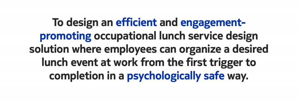
This case study was a design task given by Digitalist. I was requested to design an occupational lunch service for Digitalist’s employees so that they could figure out when and where they eat lunch and with whom at work. There weren’t any specific requirements. The main purpose was to see how I explore and solve a problem. This case took about 14.5 hours in total. 


Design Processes

The design process could be divided into three main parts. Firstly, it was exploring and defining the problem where I reframed the design brief by defining the client requirements and goals, which was followed by a user research session where I identified the right problem to be solved. Secondly, I started to create a product concept based on a validated value proposition and then detailed the concept through information architecture, interaction design, wireframe, and visual design. Lastly, I evaluate the design with defined metrics. This case study ended with my reflection on the design process. 

The success starts by spending time picking the right problem to solve.

- Paul Adams

SVP of Product, Intercom

#Explore & Define

How to define the right problem?

Why does Digitalist want to invest in developing a lunch service for employees? What business values do they expect to create? 
I assume Digitalist wants to:
  • Boost employee engagement and enthusiasm about Digitalist
  • Drive increased employee loyalty
  • Improve employees’ job satisfaction and pride in creating and delivering customer services
  • Encourage increased Employee Net Promoter Score and motivation to work on a project
  • Ultimately, employees are able to better perform and boost productivity at work and create better business value for Digitalist. 
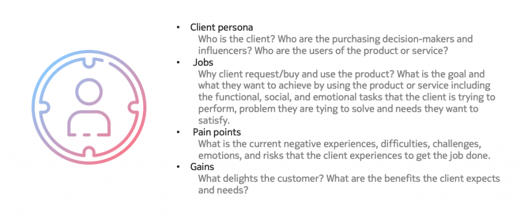
Research Plan
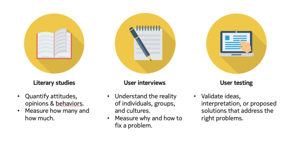
Considering the limited time and resources for this task, I planned and conducted exploratory research to gain a better understanding of the problem.
In human-centric design, I recommend primary research, going directly to the customers to ask questions and gather data, like interviews or usability testing. It would help to answer questions about why or how to fix a problem. Primary research can be supported by secondary research, like literary studies, to find out relevant information about the problem and potential solutions. It is about quantifying attitudes, opinions, and behaviors. I could collect data by measuring and analyzing it through numerical comparisons and statistical inferences. Numerical data measures how many and how much. Besides, user testing would happen across the whole design process validating every design idea and decision.
#Literary Studies
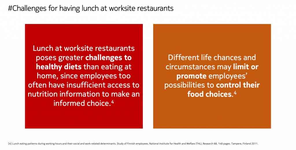
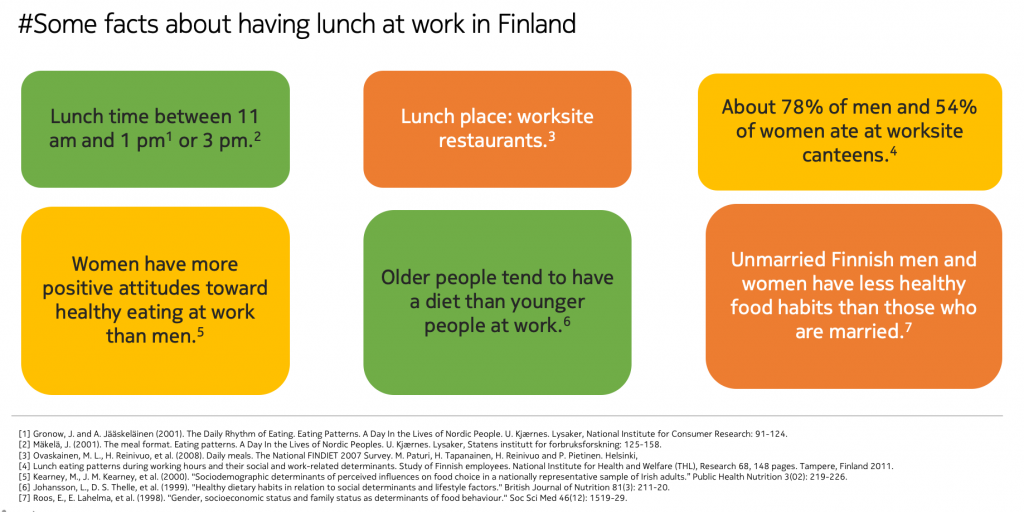
Through a quick literature review, I found some facts about having lunch at work in Finland. In Finland, lunch is a meal that is eaten in the afternoon, usually between 11 am and 1 pm or 3 pm. Lunches during the workday are today mostly eaten in worksite restaurants. A worksite restaurant is a specific place, located near or at the workplace, where employees could receive a reduced price that is subsidized by the employers. About 78% of men and 54% of women living in the capital area ate at worksite restaurants. Women have more positive attitudes toward healthy eating at work than men. Older people tend to have a diet that is more in line with nutrition recommendations than younger people at work. Also, unmarried Finnish men and women have less healthy food habits than those who are married.
 
#Findings and Insights
  • Eating out during the workday is indeed a big requirement for employees.
  • Gender, age, marital and parental status are associated with lunch behaviors at work. So it is important to keep user samples as diverse as possible when doing user research.
  • To deep dive into the lunch solution, I should not forget about the social and cultural perspectives and systematically explore meal format, eating patterns, and the social organization of eating.
  • The external factors like surrounding restaurants, workplace policies, and social norms among co-workers play an important role in lunch place choices among Finnish employees. Therefore, it is necessary to investigate those aspects in Digitalist to holistically understand the problems.
  • Good to know the challenges but need to verify them.
​​​​​​#User Interviews
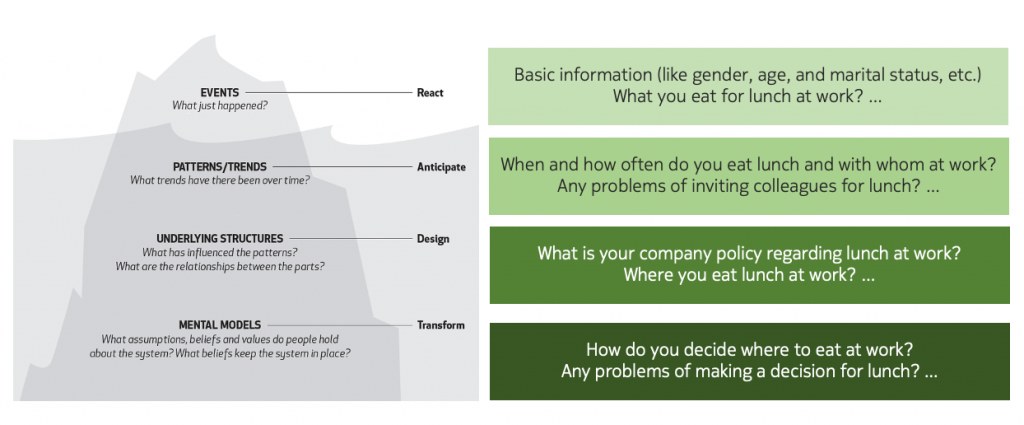
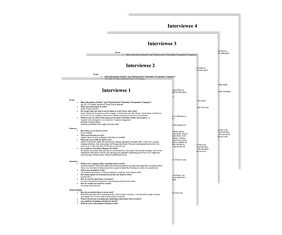
Applying system thinking helped me understand users’ lunch needs holistically. The interview questions were designed following the Iceberg model. From events to patterns, then to structures, and lastly to mental models. At the event level, I need to discover what just happened, like the background of the users. What and when do they eat at work? At the pattern level, I will identify what trends have been there over time. For example, when and how often do they eat lunch and with whom at work? At the structure level, I would like to know what has influenced the patterns (e.g. company policy, physical structures). Last, at the mental model level, I want to understand what beliefs and values users hold about the lunch service and what beliefs keep the lunch service in place. For example, how do they decide where and what to eat at work? Why is that? How do they see about lunch at work?
I conducted four interviews with the target users to further understand the user groups as well as their goals and frustrations. 

#Participants
Four employees from Digitalist, Nokia, Huawei, and Avaintec respectively were recruited for the interview. The participants varied in their marital status (two married, two unmarried), background (security engineer, architect, designer, project assistant), age (between 25 and 36), and gender (two male, two female).
 
#Procedure
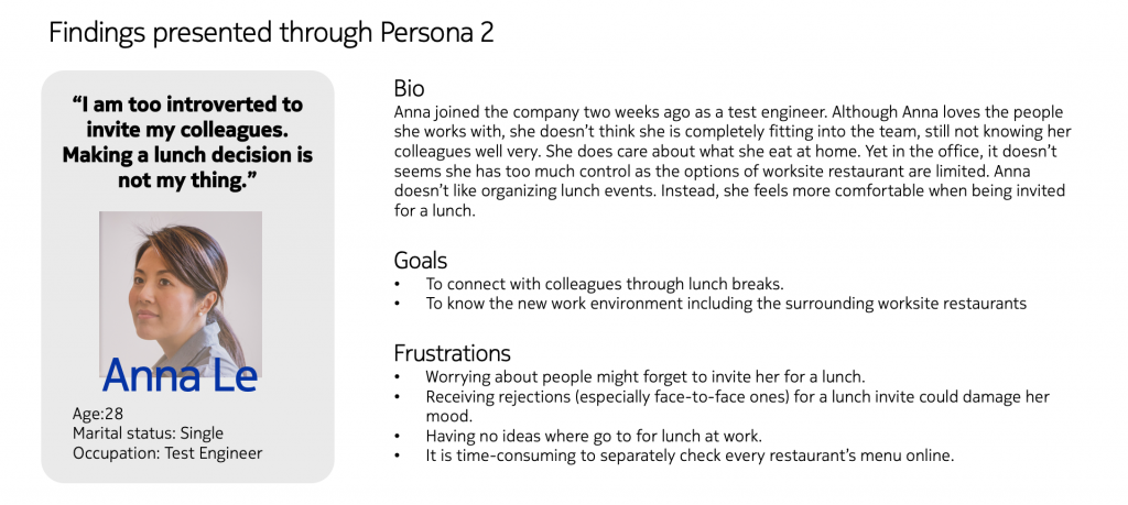
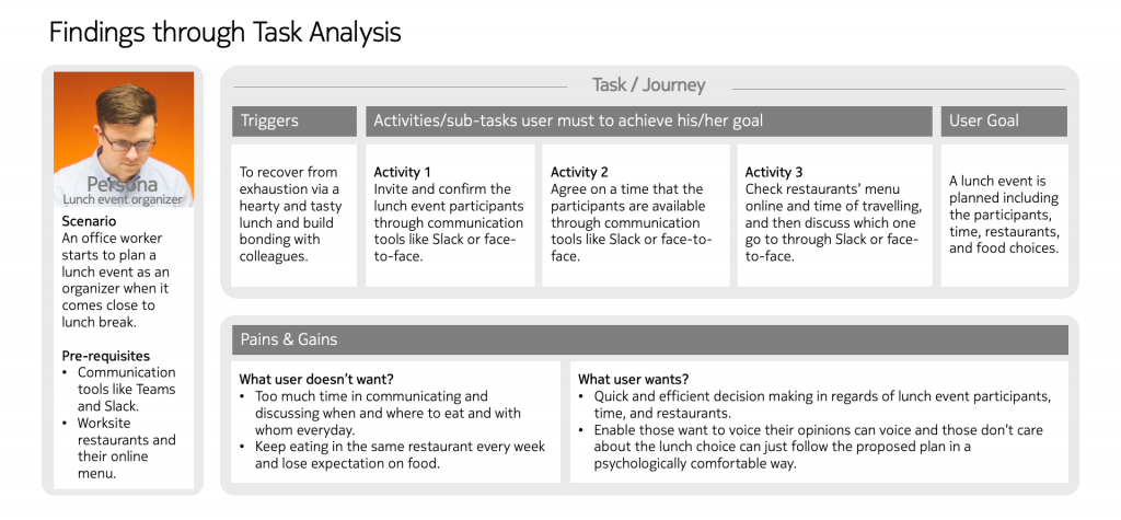
The interviews were conducted through phone calls. Each session lasted for 30 minutes. In the first five minutes, I explained the purpose of the session and the actual interview happened for the rest of the 25 minutes. The interviews were semi-structured, and which were able to discover unexpected stories. Interview findings were presented through user personas and task analysis.
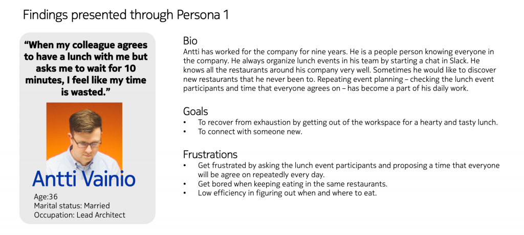
The participants reported that when it came to lunch break time, they needed to organize a lunch event where they could get a recover meal and build bonding with each other. They communicated and discussed through Slack or f2f to figure out the participants, time, and restaurant. The whole process was very slow. Therefore, they suggested faster and more efficient communication tools or functionalities in the current tools. I kept asking why to explore the proposed “need” and the proposed “functionality”. I found out not everyone was happy with the lunch plan as some of them couldn’t or didn’t want to voice their opinions. What users really want is to make decisions in a faster, more efficient, and more engaging way and everyone can respond in a psychologically safe way. It is about decision-making instead of communication. This is the only way that could produce a lunch plan that everyone is happy with. So the criteria for solutions is to minimize time to the desired end result and the criteria for end result is to maximize engagement and satisfaction in the agreed lunch plan. 
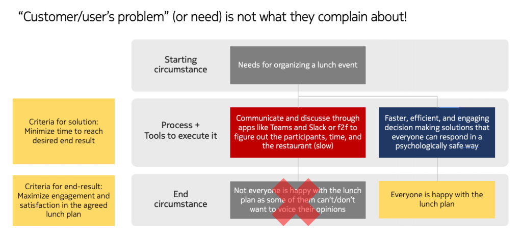
Product Vision​​​​​​​

#Ideate & Prototype

Product Concept

I came up with a product concept called Lunch Planner, which is a Slack-based solution for quick and efficient lunch event planning that all the team members can engage in to make a lunch decision jointly. Why it is a Slack integration? Because Slack is used in Digitalist for team communication according to the interviewee. With this, product development and adoption need minimum onboarding training costs, lower IT costs as well as lower customer churn because it won’t change users’ current behaviors and mental models. It avoids app fatigue that hurts overall productivity and user engagement leaving users consistently overwhelmed, aggravated, and fatigued. 
 
  • Enables a lunch event organizer to make a lunch plan targeting a single person or a group of colleagues quickly and easily.
  • Helps lunch event participants to voice their opinions about the restaurant choice through voting.
  • Provides employees with wanted info (e.g., a list of restaurants nearby, distances, ratings, menus, and specific info about the food, etc. ) to make a lunch choice decision.
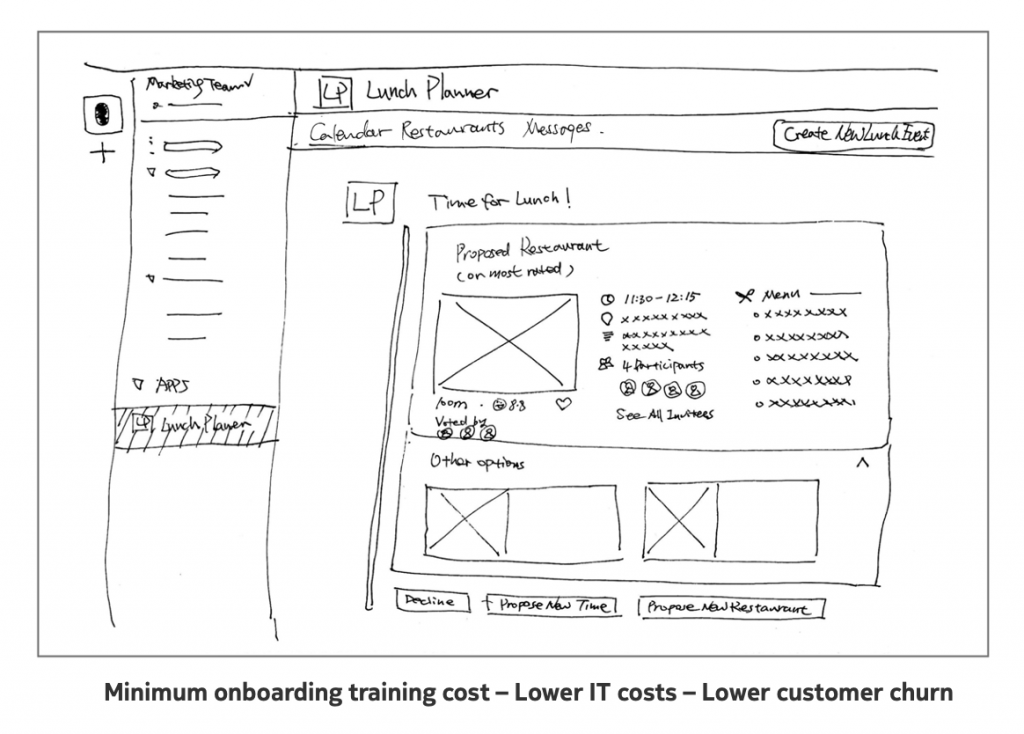
Testing Concept
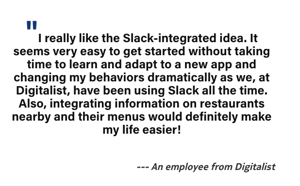
I conducted a concept walkthrough session with an end-user from Digitalist to gain feedback on the concept by walking him through the new desired experience with some sketches and asking for his comments. The proposed solution received highly positive feedback. The user liked the idea of integrating relevant information, which he believed would make his life easier. Besides, he clearly reported he definitely wanted to try the solution as a Slack plugin because he felt like it wouldn’t take much time to learn and change his current behaviors. 

Information Architecture 

To make sure users find information and complete tasks, I organized, structured, and labeled the possible content. There are five categories: Event Creation, Calendar, Restaurants, Messages, and About. In the event creation, users could see information like event titles, invitees, channels that events are shared with, date, duration, time, repeat, description, and restaurants, which are all necessary to define a lunch event. In the calendar, users could view the planned lunch events with the restaurant name, rating, time, distance, description, and participants as well as actions like edit, delete, decline, and propose. As for the restaurant category, users could view the top-rated nearby, the popular right now, new restaurants, restaurants I like, etc. In the message, users receive the lunch event notification as a message where they see the restaurant, participants, opening hours, votes for restaurant choices, time, description, and actions like decline, propose a new time or a new restaurant.
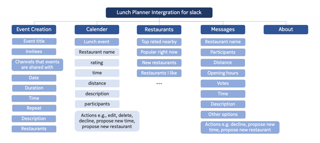
Interaction design

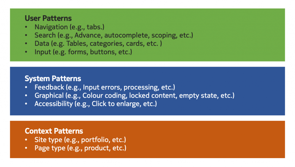
Once the information architecture was ready, I started thinking of the interaction behaviors. What design patterns could be used for organizing content? 
 
For user patterns, I chose tabs for navigation between different categories. The search could be advanced, autocomplete, or scope. The data like restaurant information could be presented through cards, tables, and categories. For input like creating a lunch event, forms and buttons could be useful. 
For system patterns, input errors and processing should be given as feedback. 

Graphical elements like color coding and empty status are considered. To enable accessibility, users could click to enlarge to read more information.
As for the context patterns, the restaurant’s options could be presented as a portfolio. The page type is defined for the product. 
Wireframes
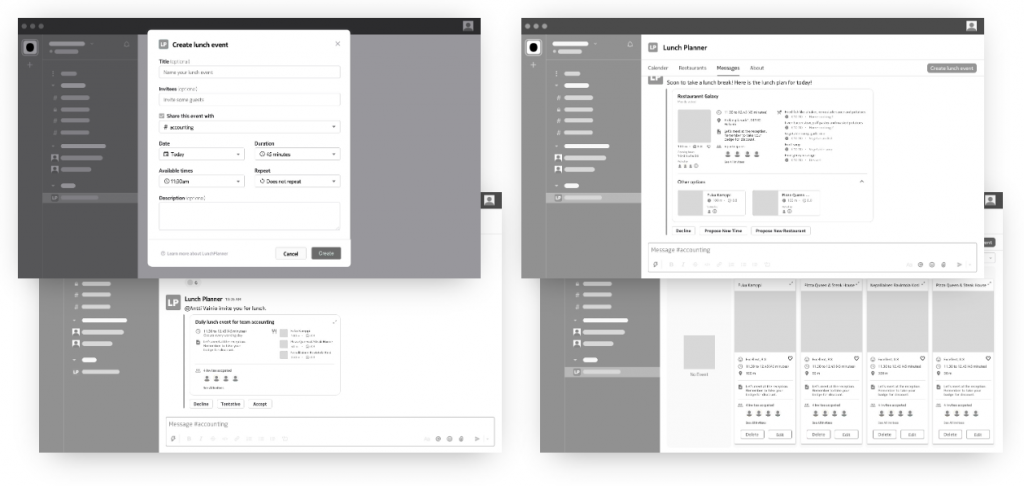
With the defined design patterns, I quickly created wireframes to figure out the skeletal framework of the application including the layout and arrangement of the content. Through the wireframes, I defined the functionality, behavior, and priority of content.  

Visual Design

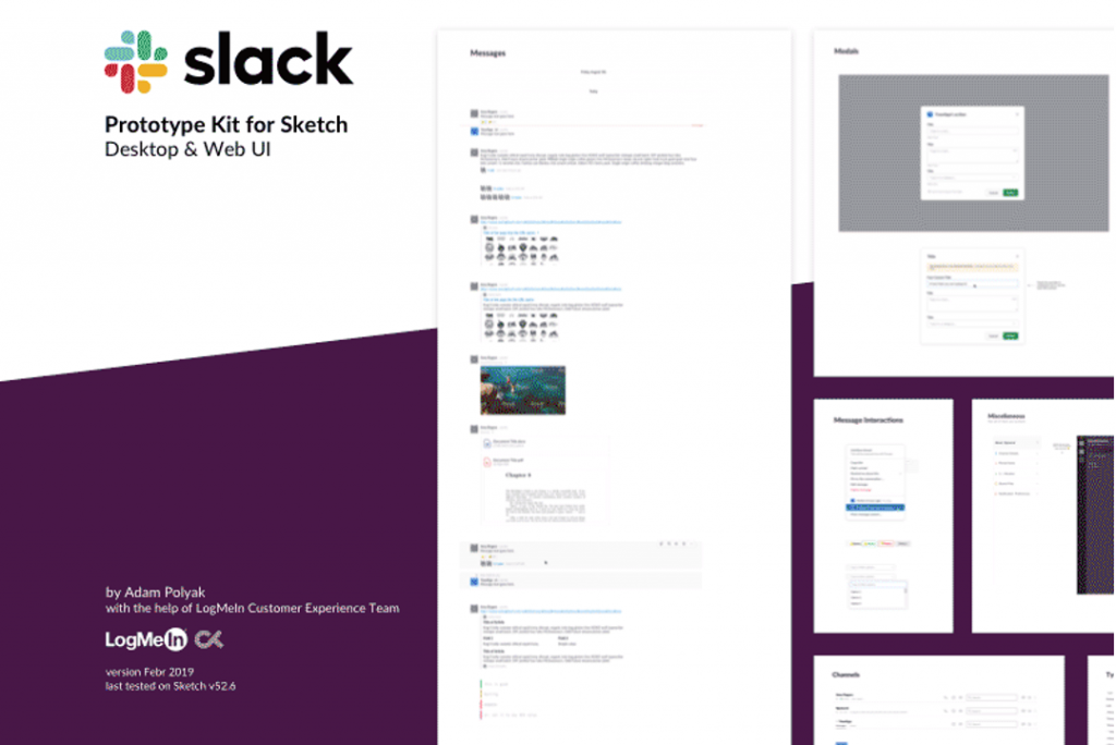
As for the visual design, I used a Slack UI kit including colors, shapes, signs, symbols, cards, tables, graphs, typography, etc. to build a common visual language in Slack ensuring a seamless experience.

#Evaluate & Deliver

Evaluation

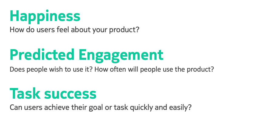
I adopted and customized the Google Heart Framework to measure the performance of the design in three categories: happiness, predicted engagement, and task success.
Happiness describes metrics that are attitudinal in nature. These relate to subjective aspects of user experience, like satisfaction, visual appeal, likelihood to recommend, and perceived ease of use.
 
Predicted engagement tells the intention of use. whether people wish to use it or not? If so, then how often will people use the product?
 
The Task Success category encompasses several traditional behavioral metrics of user experience, such as efficiency (e.g. time to complete a task), effectiveness (e.g. percent of tasks completed), and error rate. One way to measure these on a large scale is via remote usability or benchmarking study, where users can be assigned specific tasks.
 
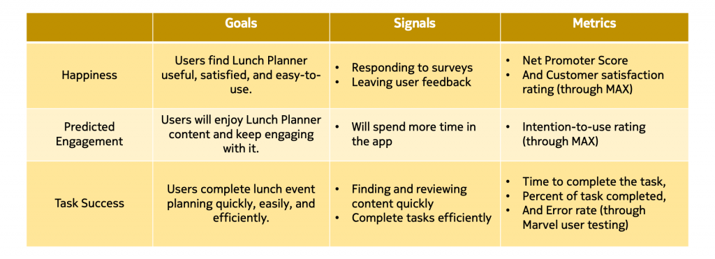
Besides, I need metrics to evaluate the state and progress. I articulated the goals of Lunch Planner, then identified signals that indicate success, and finally built specific metrics to track.
​​​​​​#User Testing via Marvel
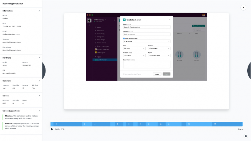
I first created a clickable step-by-step prototype through Marvel and then ran online design review sessions with the previous four interview participants. I observed them completing the given tasks and captured and viewed every tap, click, comment and reaction.
The testing received highly positive feedback. All those four participants hit the goal screen and completed the task eventually. The misclick rate was 9% which was acceptable. the average duration for planning a lunch event was 1 minute and 40 seconds, while the average duration for deciding time, participants, and the lunch choice was 52 seconds. According to the participants, the time to plan the lunch event was 4 times or even 5 times faster than it was in practice, which was definitely a big achievement.
​​​​​​#MAX (the Method for the Assessment of eXperience)
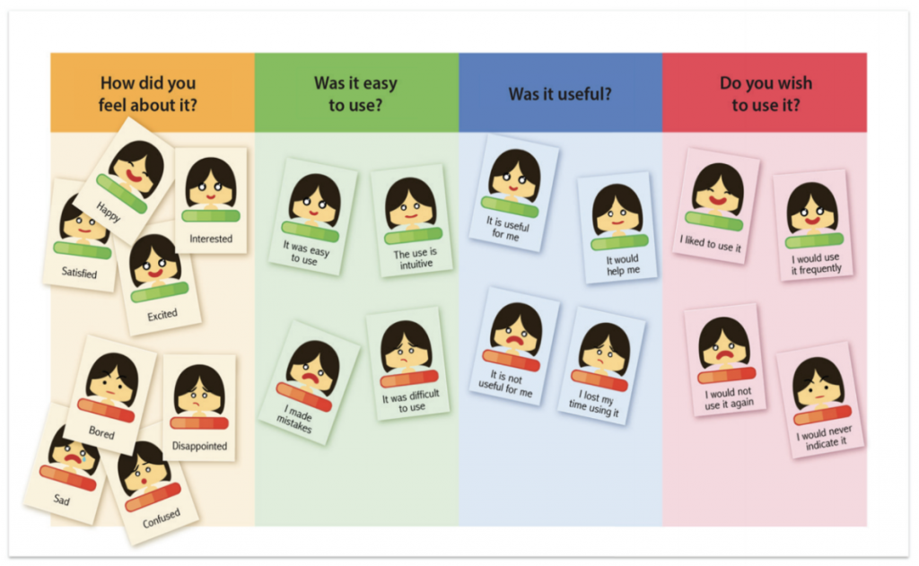
After trying out the prototype, the participants were given a rating task through MAX. It allows the users to evaluate the hedonic and pragmatic aspects of Lunch Planner. MAX contains a pile of cards representing different attitudes with intensity ranging from one to four and a board on which four questions are displayed. The users are guided in the evaluation through the four prompts as follows: a) “How did you feel about it?” (it is about emotion) b) “Was it easy to use?” (it is about ease of use) c) “Was it useful?” (it is about usefulness) d) “Do you wish to use it?”(it is about the intention to use)
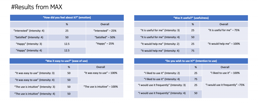
The proposed product concept, Lunch Planner received very positive feedback. 50% of the participants reported they were satisfied with using Lunch Planner, and 25% stated they had a happy experience when creating a lunch event through Lunch Planner. In addition, 25% of the participants were interested in using Lunch Planner. As for the ease of use, all the participants claimed it was easy to use and the usage was intuitive. 75% of the participants admitted Lunch Planner was useful to plan lunch events. All the participants made their attitudes clear that they liked to use Lunch Planner, and 75% reported they would want to Lunch Planner frequently.

​​​​​​To Be Improved

For small groups like 2 to 3 people, the current design solution requires more thinking to make sure it would also motivate users as sometimes it can be more convenient to directly ask the colleagues sitting next to you for lunch f2f. 

Some visual improvements like the design for voting restaurants could be more prominent and self-evident.

It will be better to put lunch price and whether it supports Edenred and Smartum or not there when viewing restaurants, which is also important info to make a lunch decision. 

Benchmarking to be done

When I have numbers, I must compare them since I have no idea whether the progress is good or bad. Benchmarking allows assessment of the impact and improvement and is helpful to reflect on the process and design choices. The real power of benchmarking comes when I show the results to stakeholders or clients by demonstrating the impact of the design work in a concrete and unambiguous way. However, because of the time limit and other factors, I couldn’t make this happen. But I would still like to indicate how I would like to do it. 
 
  • There are two possible reference points to compare the metrics in this case study:
    Comparing to an earlier situation before using Lunch Planner, like time to
    make a lunch event, numbers of a system for making a lunch decision, group lunch rate, etc.
  • The stakeholder-determined goal, Benchmarking to a stakeholder-determined goal is straightforward, it just requires systematic practices for collecting data, storing results, and making comparisons.  

#Reflection

What was missing or what could be done better

A lot went right, but as with any project, things also went wrong. I like to reflect on the successes and failures of every project so that I can learn from them and apply those learnings in the future. Here I want to present something missing or could be done better in this case study.

As I have emphasized many times, proper customer research should happen to define the business goals and requirements rightly before starting the design work. Validating the value proposition with real stakeholders is also very important as we must know whether all the design work is valid and right or not before investment. I believe more design opportunities and product concepts could be discovered, and the design details could be better polished if there is enough time for me in this case. Also, the sample size should be big enough to produce valid and convincing design decisions during the research phase. As I just mentioned above, benchmarking the current situation can help validate the true impact of the design solution.

Key Takeaways

At the end of this case study, I would like to point out some key takeaways. 

First, design should start from the business value proposition. Jumping right into the users’ requirements in the very first beginning couldn’t make it. it is a good design for the clients if you don’t consider their business goals, process, and values to be achieved.

Second, defining the right problem in the very first beginning is important. Success starts by spending time picking the right problem to solve. 

Third, deep-diving into the customer/user problem. User’s problem (or need) is not what they complain about! What customers complain about and call a “problem” is indeed a problem – but it’s a problem in the current solution. Not the “problem” that the solution is supposed to solve. Building products only based on customer requests don’t create a competitive advantage. Competitive advantage comes from unique solutions that provide value to the user and customer’s business. It requires learning about context, needs, and expected outcomes to identify unique opportunities and unmet needs. Processes must be designed together with the product. My advice to research client or user requirements is to ask questions (Why) until you get to know what
the solution must do and why is that. 
 
Fourth, this case study follows a typical hypothesis-driven design philosophy. Create a hypothesis statement first, I believe that creating this for the target customers or users will achieve this outcome. And then test to verify the hypothesis. Afterward, metrics are defined to measure the results of the experiment. Finally, the criteria for success tell us if the hypothesis is good enough. Last but not least, continuous evaluation and benchmarking. Constant testing ensures the design is on the right path, determining what works well and what doesn’t, why, and what needs to change. These evaluations occur throughout the design process, providing information for incremental improvements. Benchmarking allows assessment of the impact and improvement.