UX&UI / 2021
Redesigning the Website of Wayout for Effective Customer Reach
Responsibilities: UX Design, UI Design & Interaction Design
The Challenge
As a startup, the most current urgent task for Wayout was to increase its exposure to a larger customer base. Digital marketing through websites has been considered an inevitable step for Wayout. However, its current website doesn’t communicate quality information to customers. It needed to redesign the website to clearly showcase Wayout’s brand to prospective customers by clearly establishing what they do and how they do it.
My Role
I led this project and was supported by a team of 4, comprised of a Visual Designer, two Developers, and a PM. I was the sole individual responsible for user experience, and I also created some visual deliverables that you will see in this case study. I saw the project from the kickoff meeting to the launch.
Background review
I began by digging into the value proposition of WAYOUT:
– What does WAYOUT do?
– What’s the mission and vision of WAYOUT?
– What offerings do they provide?
– What kind of visual identity do they want to establish?
– What does their current website look like?
– What is missing there?
– What are the good ideas that I can take?
– What is the brand guide?
Content creation
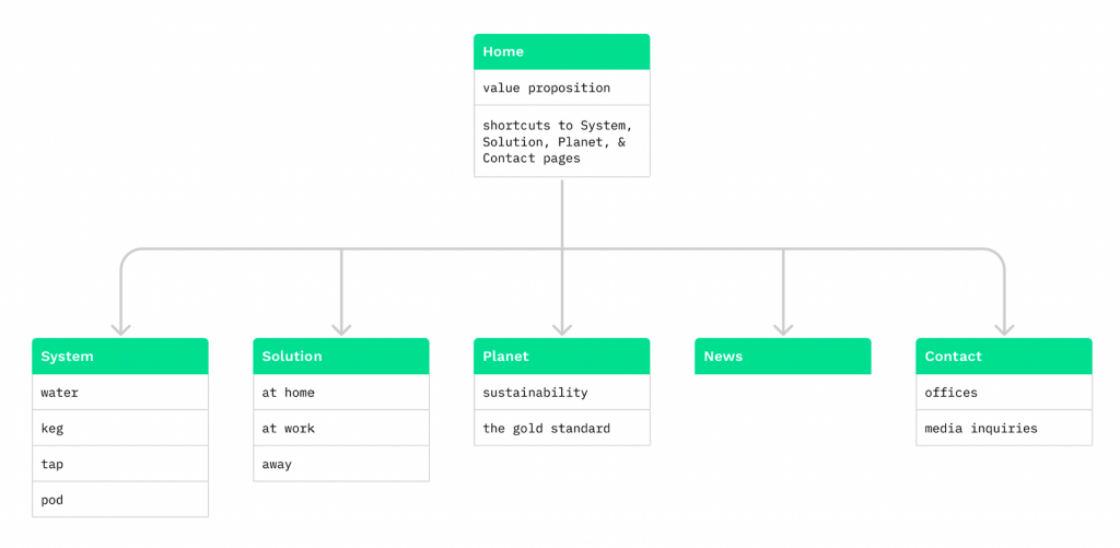
I created a site map that communicated the core pages of the website and the navigation around the website. I put them together into well-organized categories for products/service offerings. Under each category, I listed the specific sense-making content from a customer’s perspective.
Wireframes
Once we had a solid direction for the design, I began to produce wireframes. I put the designs in front of the customer for testing and feedback. Through multiple rounds of reviews, I narrowed the design down to a solid and mature design framework and thus moved into visual design. Together with clients, we experimented with a wide array of designs, eventually landing on a scrollytelling structure which is the fusion of scrolling and storytelling: a way to dynamically tell long-form stories as the user scrolls. In this framework, user activity triggers transitions between elements and styling methods of all sorts: alternating texts, changing imagery, interactive backgrounds, animation effects, sizing changes, and more. Every single element blends together and conglomerates to form a flowing, alluring story in motion.
A living design
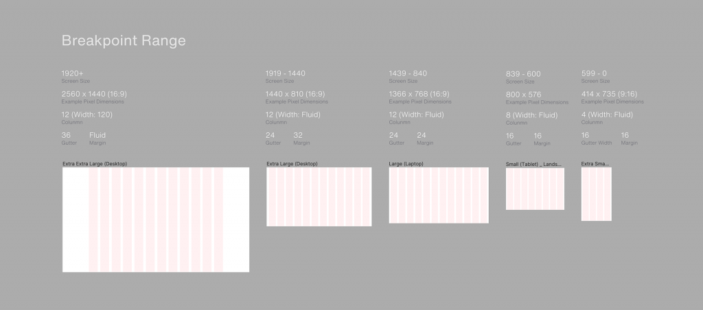
In the interest of high performance for the website, this design needed to be scalable, flexible, and alive. This is one of the primary reasons why I went with such a grid-based structure. It would scale well across devices including mobiles, tablets, laptops, and big monitors.
Mockups
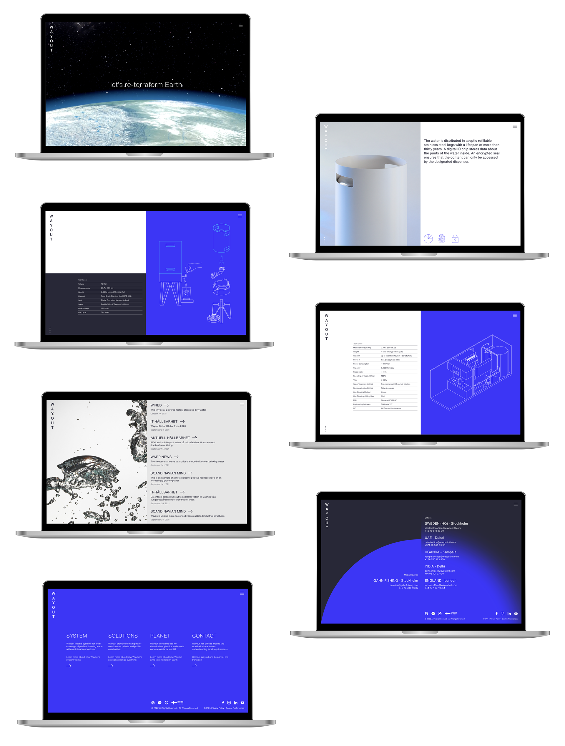
During the visual design phase, I worked directly with Jani, our awesome Visual Designer. Following the brand guide, he used a mix of clean lines, strong typography, bold colors, unique imagery, and an atypical grid structure to elevate the design to a new level for Wayout.

Interaction design
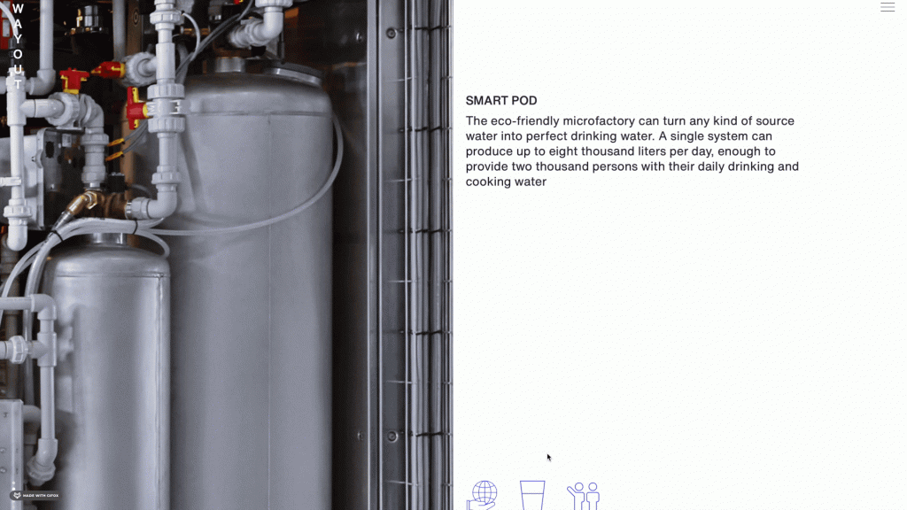
In the original design, it was very static, and felt as if it went straight from the PSD to the code. So in this iteration, I used interactions to bring the page to life, draw users into the content, and help confirm user actions. I adopted the parallax effect, which is a scrolling effect where the background images move slower than the foreground elements, giving the illusion of three dimensions in a 2D space.
Why Use Parallax Effects
Photo framing
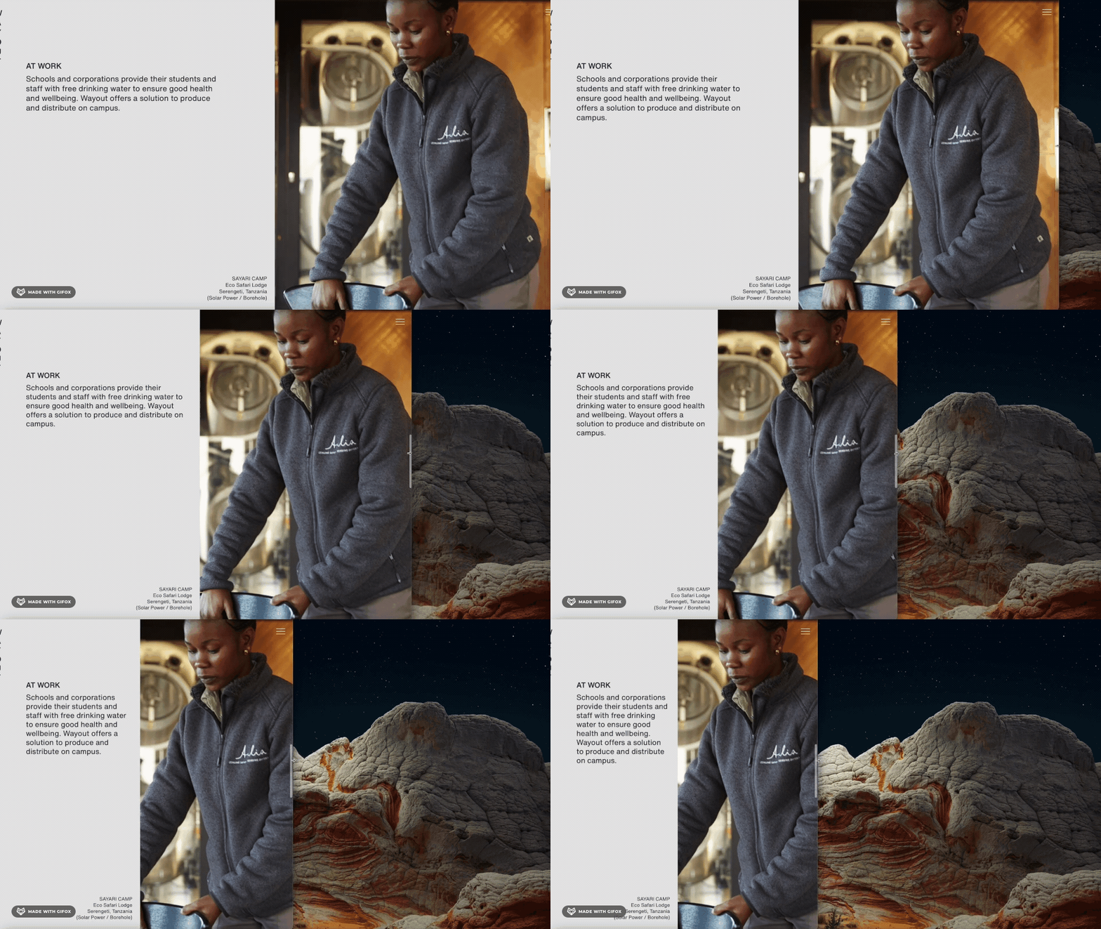
I took a very unique set of photos intended to fit perfectly into the atypical grid structure. This would allow always showing the focus section of the photo when the window expands out or shrinks down. This turned out to be a distinctive element of the design. The thoughtful repurposing of space was very important in this design and something that the client specifically noted during testing.
Internationalization and localization
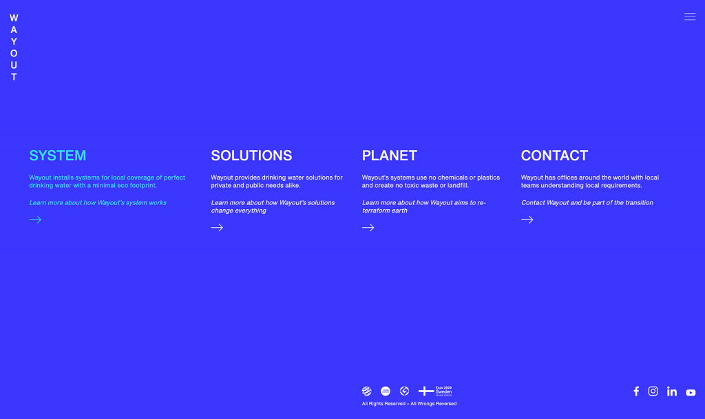
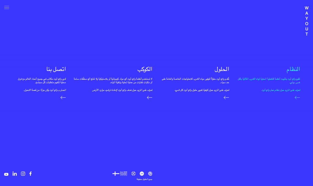
As a company targeting an international market, Wayout required a website that could easily be scaled to an equally global site. In addition to English, the pages might also be translated into Arabic. This was an important factor when considering the layout, making sure it could also adapt to right-to-left alignment.
Code development
The developers in this project did an incredible job of putting together clean code that was compatible across all devices. I worked with the visual Designer to execute all interactions properly, ensure that the design translated well to the code, and QA test along the way.

Launch
In an awesome moment, we launched the new website right as Wayout presented its brand and product at Dubai Expo 2020 on stage. The client was very satisfied with our delivery.

